A single-selection color swatch lets customers choose any color from your color options. Here you can list all available colors for your products (whether solid or two-color gradients), and customers can choose any one they like.
You can add the single-selection color swatch option to either a new option set or an existing one. You can learn to create a new option set in another part. For now, we will discuss how to add a single-selection color swatch option to an existing option set.
Go to an existing option set.
Double-click the option set name to open it or click the Edit icon.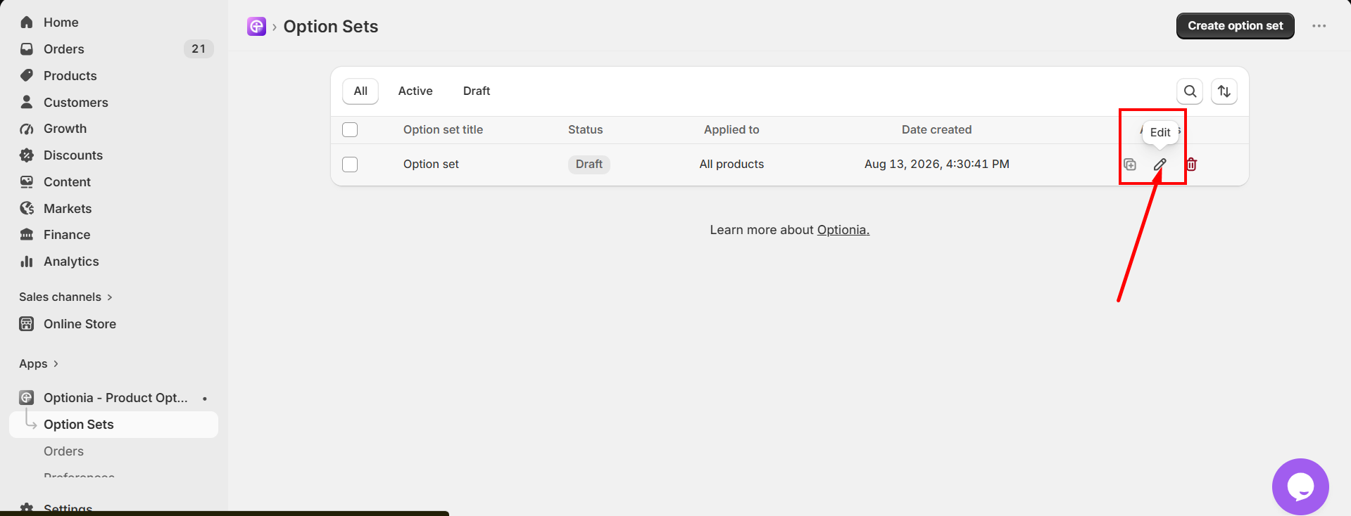
Click the “Add Options” button in the top right corner. 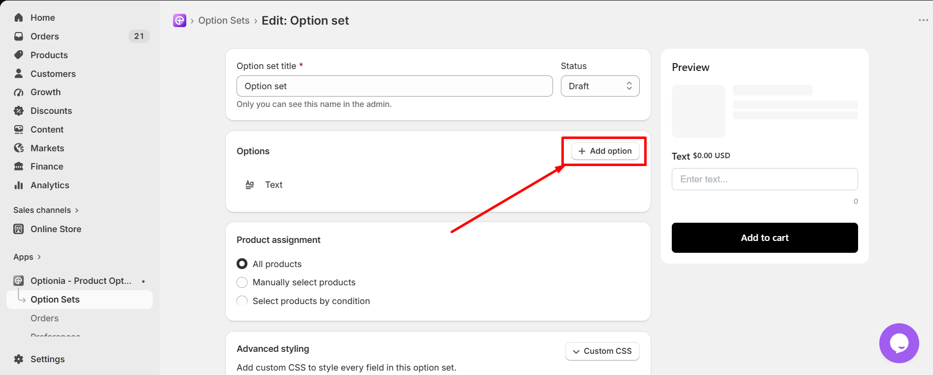
Select the “Color Swatch” option under Single Selection.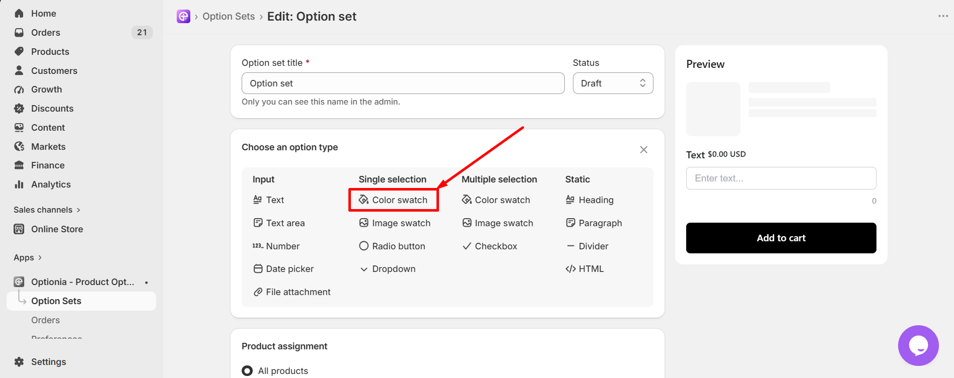
Then you can edit the single selection color swatch option as you like. Fulfill all the necessary information first: 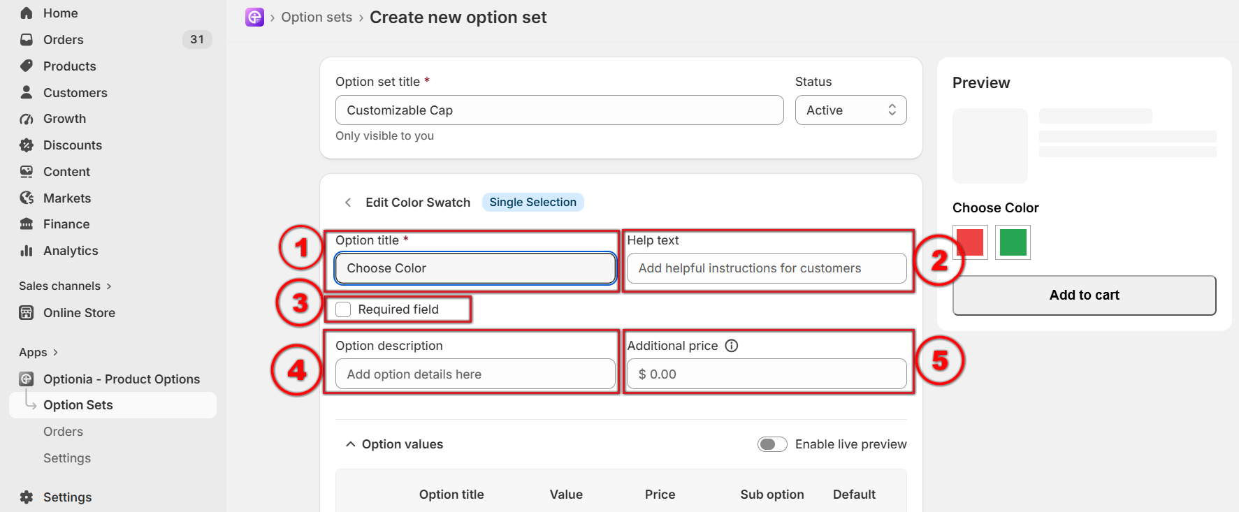
Option title: Add or edit the option title. This is a required field, so you must add the option title
Help Text: Add help text to help customers with any additional information.
Required Field: You can make an option required by selecting this field. Click on the checkbox to make an option required if you don’t want to allow customers to add the product to their cart without selecting this option.
Option Description: You can add a description in this field to clarify what kind of information to add.
Additional Price: You can set a fixed extra price for this whole color swatch option. This price will be charged when the customer selects this option.
Here, you will find several fields to fill in: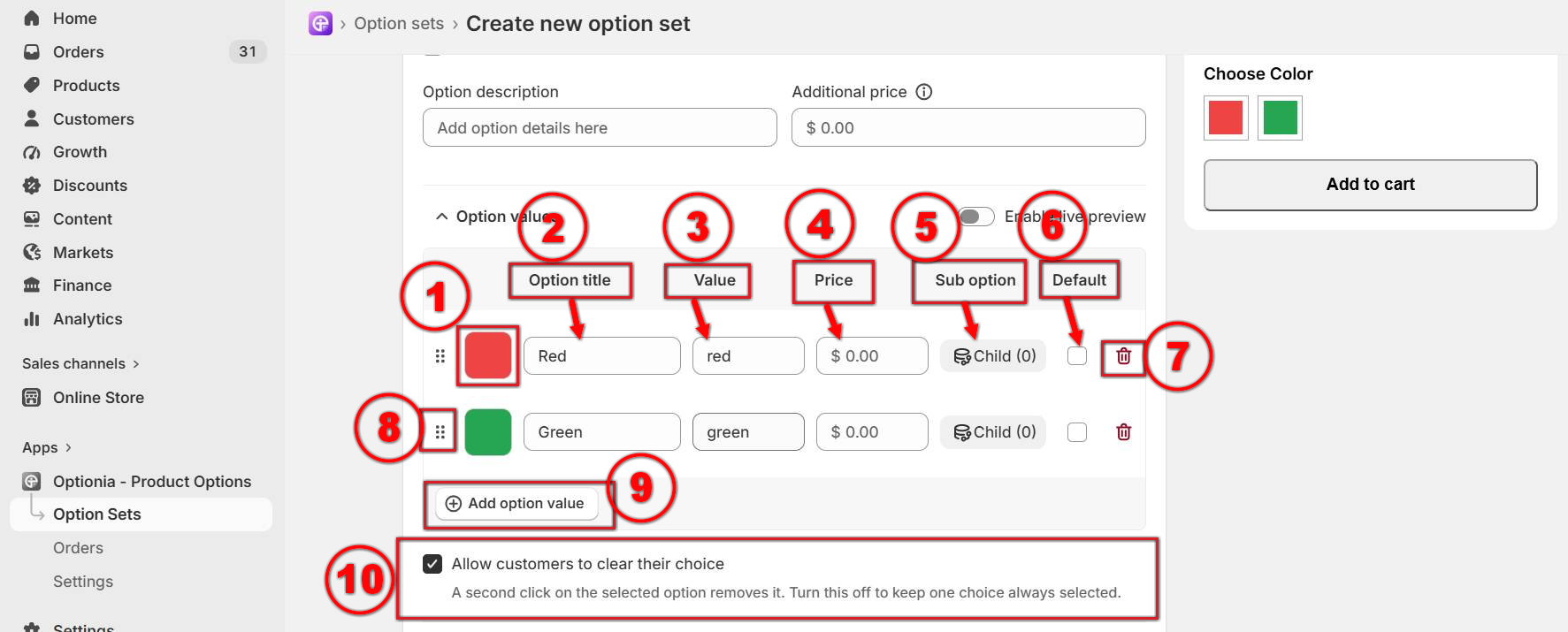
Pick a color: You can select one or two colors from here. (Click on the color box > select the Single or Multi Color option at the top > choose colors by dragging the color picker button.) 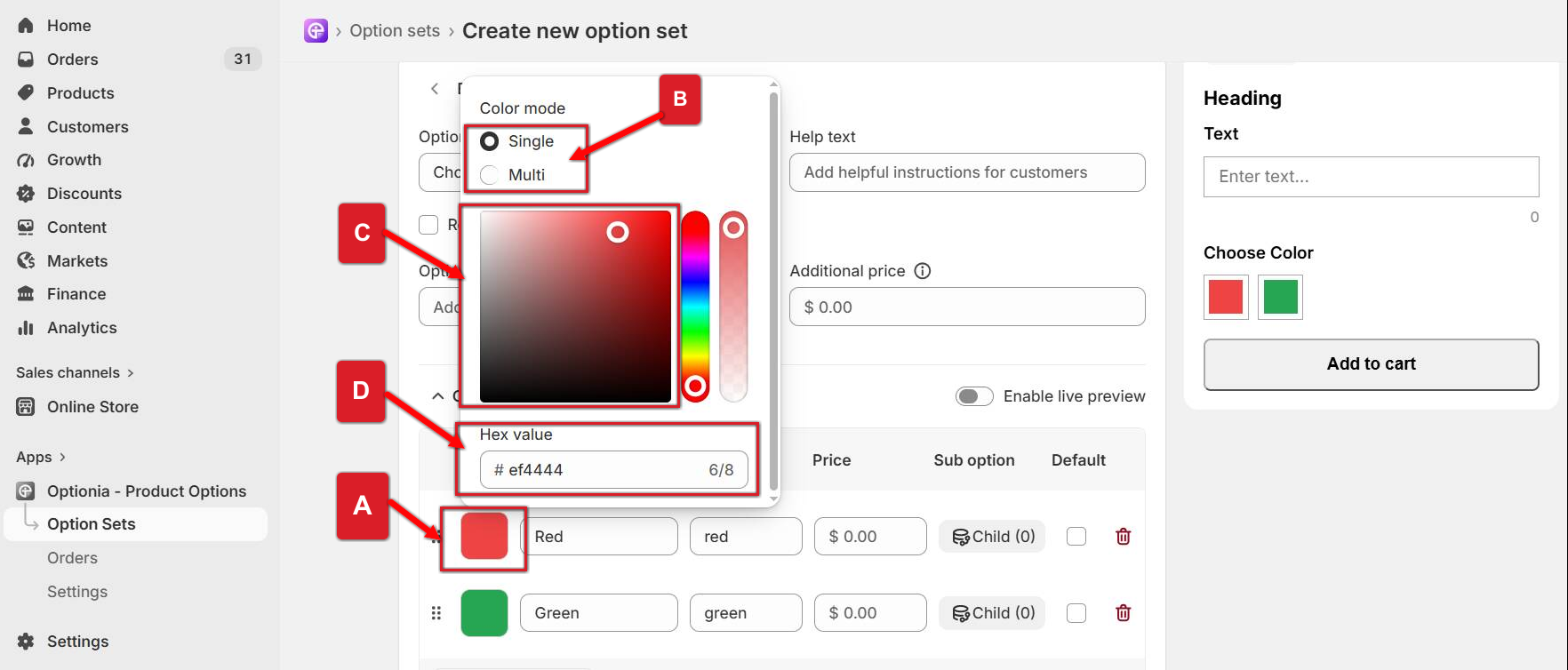
Click on the Color on option value.
Select the Single or Multi Color option.
Pick a color by dragging the color picker.
You can also add the Hex value of your preferred color in the Hex Value field shown in the image below.
Option Value Title: You can add a title(Color Name) for the option value.
Value: The Value field will be updated automatically based on your option title. If you want to change the value, you can enter a new value in this field.
Price: You can set an extra price for each option value. Enter the additional amount in the Price field. This price will be added to the product’s base price when a customer selects this option value.
Sub-Option: A sub-option allows you to display additional options based on the customer’s selection in the previous option
For example, if Color is the parent option and you have Red, Blue, and Green as values, you can add Design as a child option under the Red color. When a customer selects Red, only the designs available for the red color will be displayed. Similarly, you can add different designs under Blue or Green, and those designs will appear only when the corresponding color is selected.
Default: Check the default box for a color, which will appear as the default color on the product page.
Delete: Click on the red trash icon to remove the option values, including all of its conditional child options (if any).
Reorder: Click and drag the dotted icon to rearrange option values.
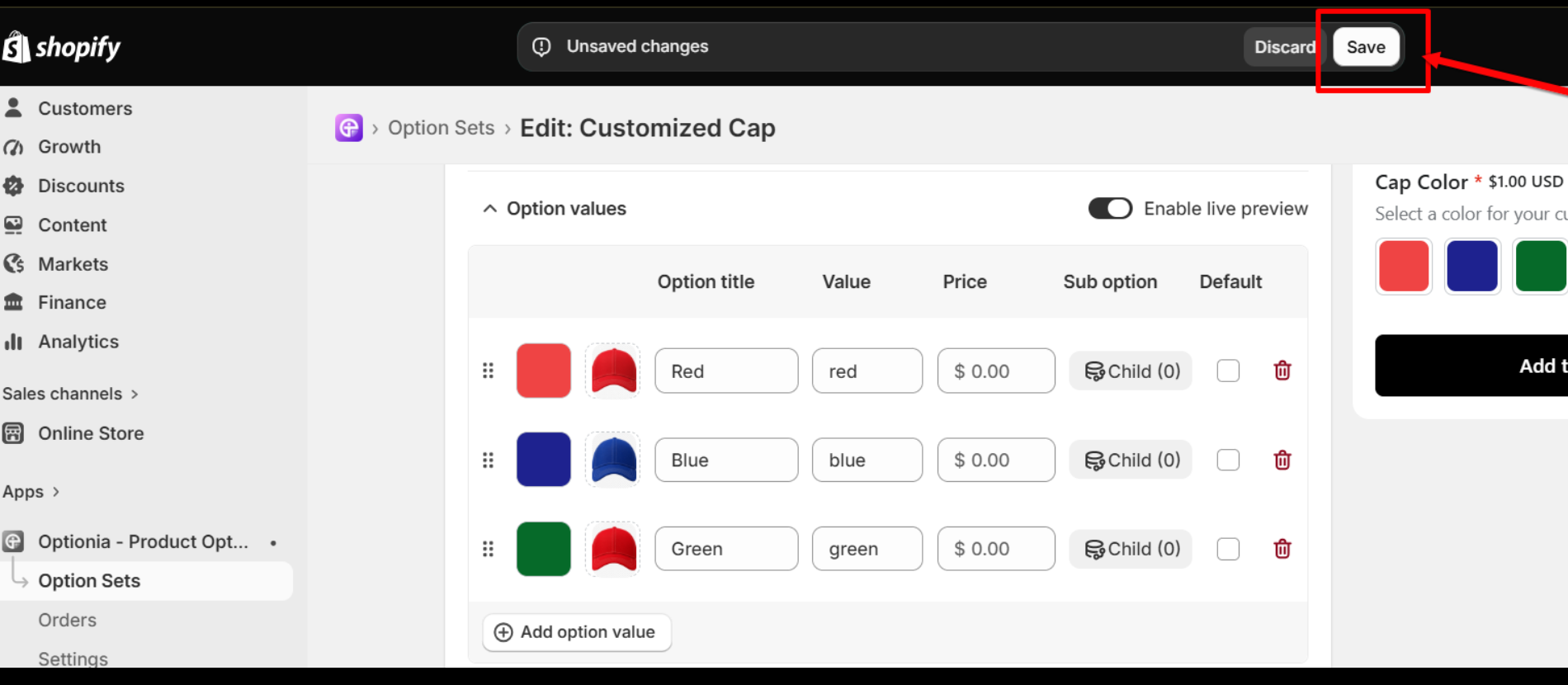
Add option value: Click here to add another attribute. You can add multiple option values for more colors by clicking on the “Add Option Value” button.
Preview: Preview will show you how the option will display on the product page. You can check the newly added color swatch option on the preview. 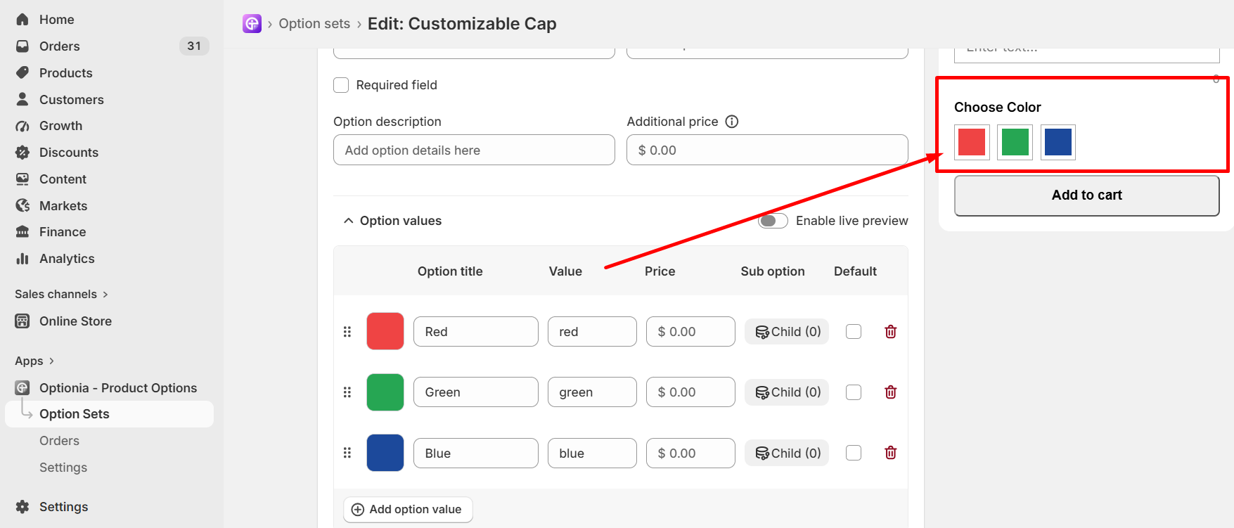
Click on the “Enable Live Preview” button to upload an image for each color swatch. When customers select the color on the product page, they will see the live product image of each color directly on the product page.
Please follow the steps below to set up the live preview on the color swatch option.
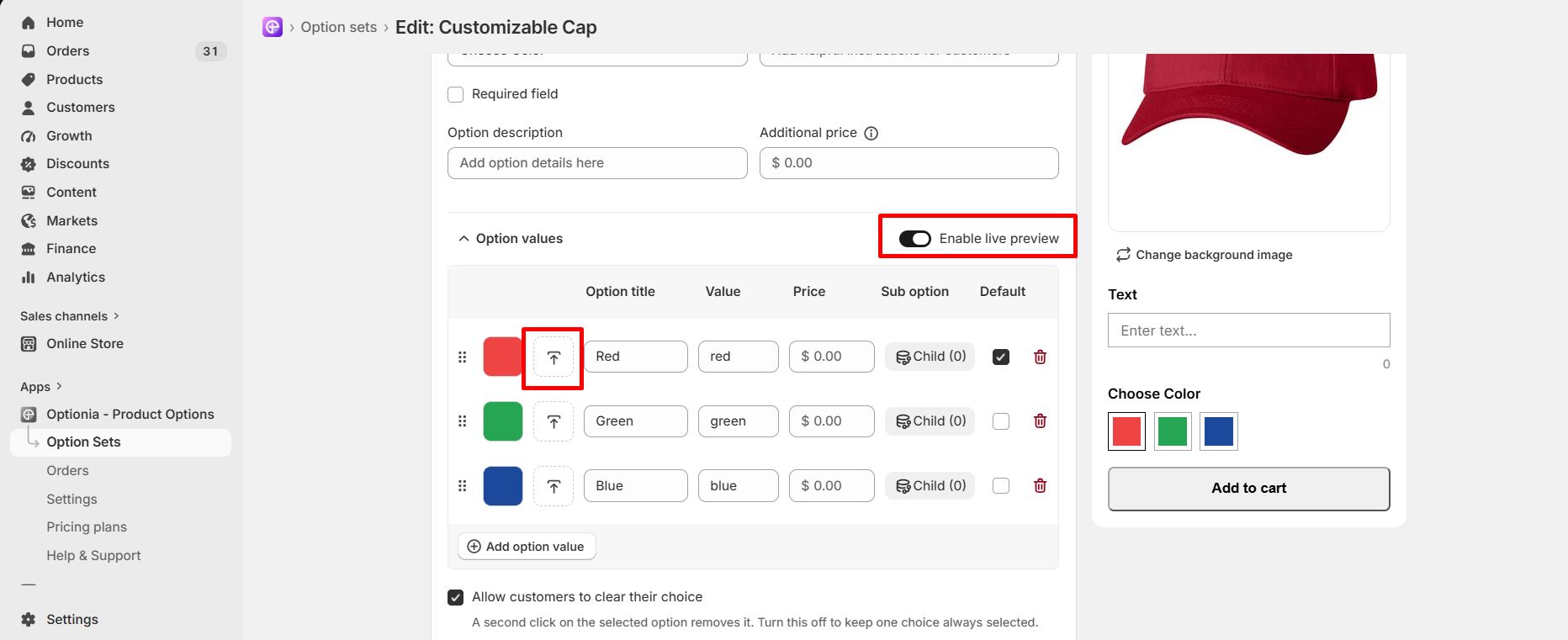
Click on the “Enable Live Preview” button to enable the image upload option for each color.
Then click on the upload icon to upload the product image for each color.
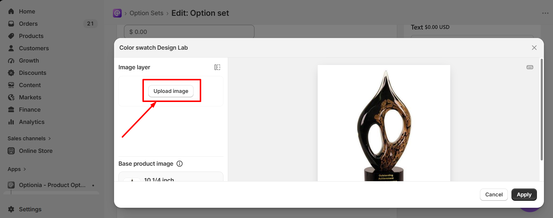
In the upload window, you can add an image in two ways: Shopify Image or Upload Image. Click the drop-down menu to select your preferred option.
Shopify image: Select the Shopify image option from the drop-down. You will get the list of all Shopify products and can select one from them, like the image below.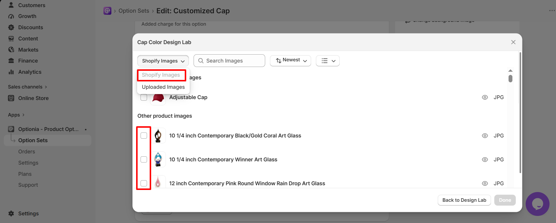
Upload image: Select Upload Image from the drop-down and click on the “Add file” button to upload an image from your device. Accepted file types are PNG, JPG & WEBP. 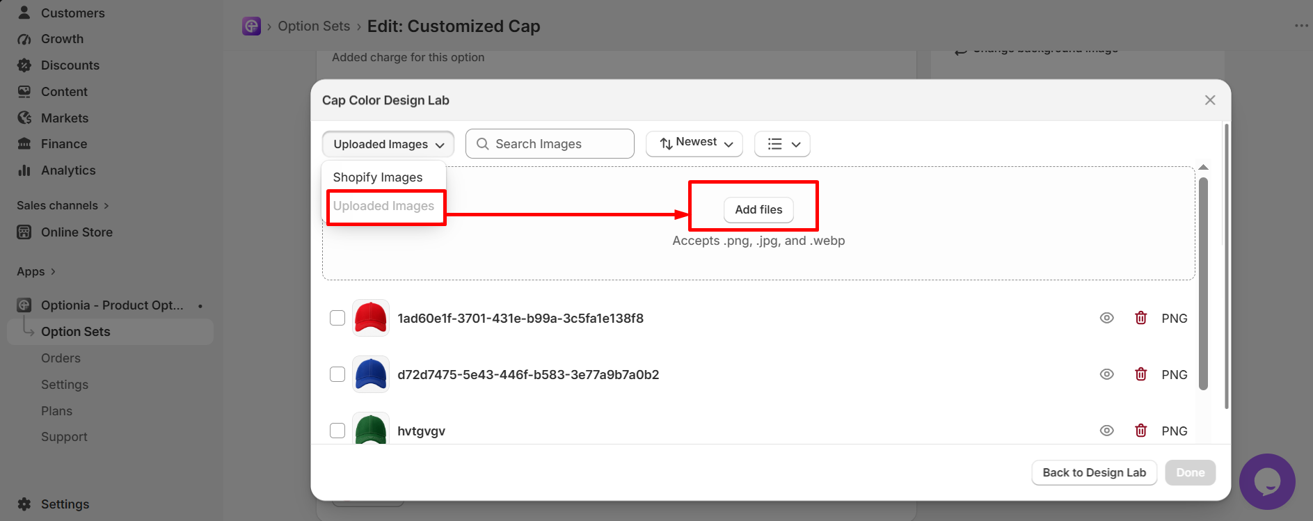
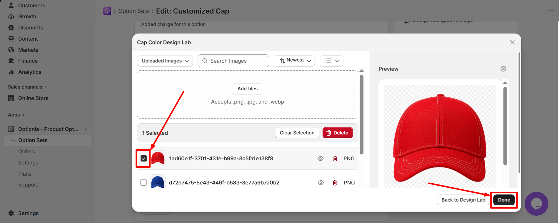
It will redirect you to the designlab with a bunch of options to adjust the image. The design elements inside the designlab are described below:
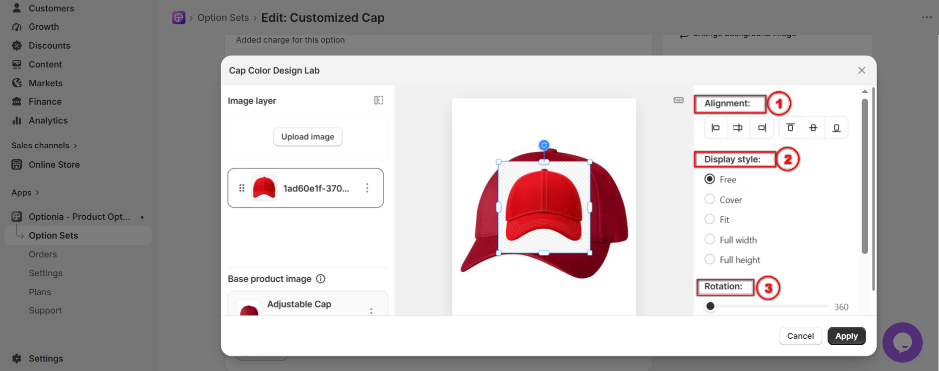
Align Left: Positions the image to the left edge of the product image area.
Center Horizontally: Centers the image horizontally within the product image area.
Align Right: Positions the image to the right edge of the product image area.
Align Top: Positions the image to the top edge of the product image area.
Center Vertically: Centers the image vertically within the product image area.
Align Bottom: Positions the image to the bottom edge of the product image area.
This section allows customers to choose how their image is displayed within the design area.
Free: Customers can resize and position their image freely within the product image area.
Fit: The image will be resized to fit within the product image area while maintaining its original aspect ratio.
Cover: The image will be resized to cover the entire product image area.
Full Width: The image will be resized to the full width of the product image area.
Full Height: The image will be resized to the full height of the product image area.
This section is only available when the "Free" display style is selected. It allows customers to rotate their image. Customers can drag the black dot to increase and decrease the degree of rotation of the image.
|
Note:
|
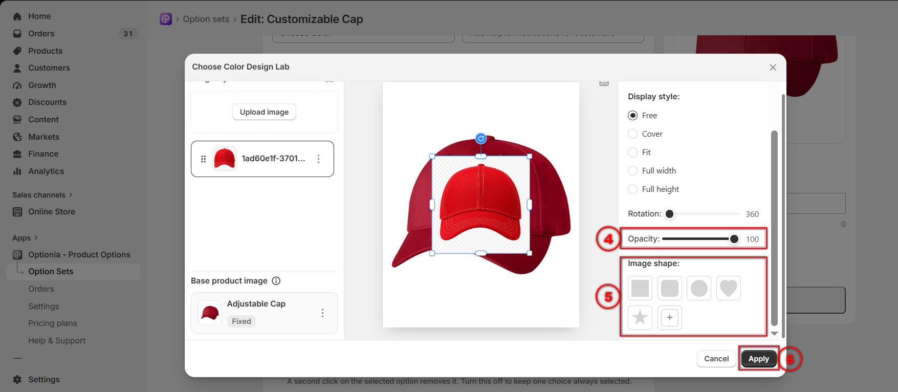
Use this setting to change the opacity of the image. The opacity is 100 by default. Drag the bar from right to left to make the image transparent. The opacity ranges from 0 to 100.
It defines the shape of the image on the cap. Click on any of the five existing shapes for your image. However, click on the + button to add more shapes to the shape library.
|
Note: Only PNG files are accepted. Use transparent-background PNGs Transparent areas in your PNG are removed, and the visible area becomes a shape. PNGs with a solid background will appear as rectangles. |
Apply:
Click on the Apply button to complete the image upload process and apply the image for the color.
After you are done with the essential settings, scroll down to find the “additional settings”. Optionia lets you style the option however you like.
In the Additional Settings, stylize: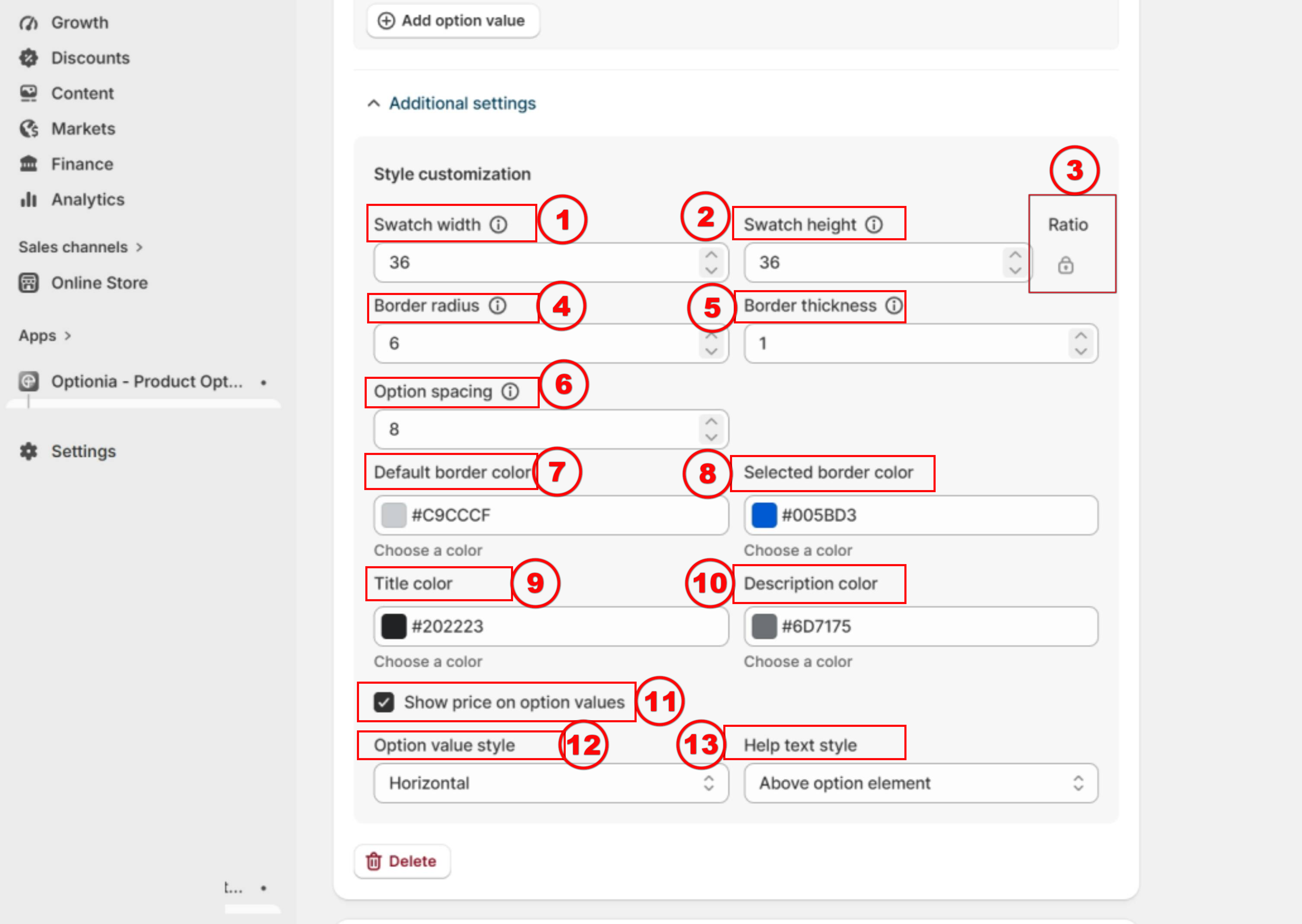
Swatch width: It controls the horizontal size of the swatch or option. Increasing this value makes the option wider.
Swatch height: It controls the vertical size of the swatch or option. Increasing this value makes the option taller.
Ratio:
(A) When the ratio is locked, height and width stay proportional. Changing one dimension (height or width) automatically adjusts the other.
(B) When the ratio is unlocked, height and width can be changed independently. Adjusting one dimension does not affect the other.
Border radius: This value adjusts the degree of corner rounding of your swatches.
Lower value → sharper corners
Higher value → more rounded or circular look
Border thickness: It sets the border thickness around the option. A higher value makes the border more visible.
Option Spacing: Option spacing allows you to increase or decrease the space between the option values.
Default border color: Defines the border color for options the customer has not yet selected.
Selected border color: Defines the border color for the selected option, helping it stand out.
Title Color: Changes the title's color.
Description Color: Defines the color of the description.
Show price on option values: If you want to display the additional price of the option, check the “Show Price with Option Value” checkbox. When enabled, the additional price will be displayed next to the option title in both the preview and storefront.
Option value style: This setting allows you to control how option values are displayed on the storefront. You can choose to display the option values vertically or horizontally, depending on your preferred layout.
Help text style: This setting controls where the help text is displayed in relation to the option element. You can choose from the following options:
Above Option Element: Displays the help text above the option elements next to the option title as a tooltip message.
Below Option Element: Displays the help text below the option element.
No Help Text: Hides the help text completely.
Bring your brand’s vibe to the option sets with additional stylization.
Each Optionia option set includes Advanced Styling with a Custom CSS feature. Scroll down to the option set and add your custom CSS in the input field. You can preview the changes directly in the Preview section. Once saved, the updated styling will be applied to the option set on the product page. 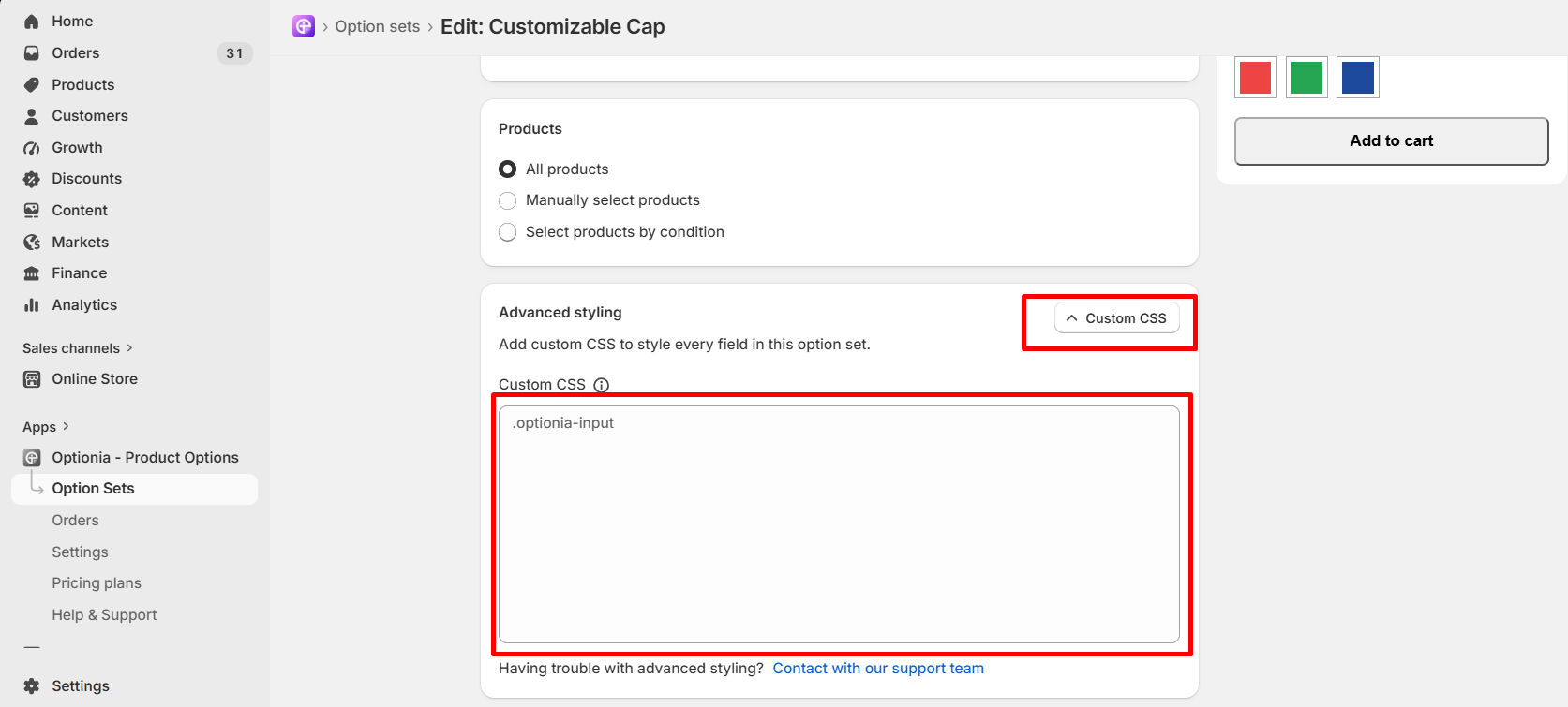
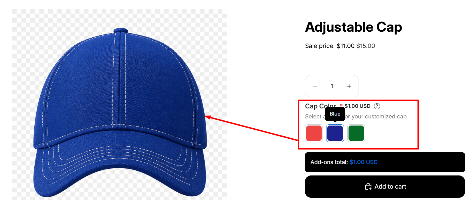
You can see the live preview of the uploaded image for each color directly on the product page. When a customer selects any color, the product image will change according to the live preview setup, like the image below.
If you have any questions or need assistance, we will be happy to help.
 Getting Started
 Option Sets
 Orders
 Settings
 Configuration
 Live Preview
 Packages
 Help & Support
 Price Add-Ons
 Conditional Logic
 Design Theme Styling
 Uninstallation