A dropdown allows customers to select one option from a list of available choices. The options remain hidden until the customer clicks the dropdown menu
A step-by-step guide on how you can add a single-selection drop-down to your product page.
Step 1: Go to Add Options
You can add the single-selection Drop-down option to either a new option set or an existing one. You can learn to create a new option set in another part. For now, we will discuss how to add a single-selection Drop-down option to an existing option set.
-
Go to an existing option set
-
Double-click the option set name to open it.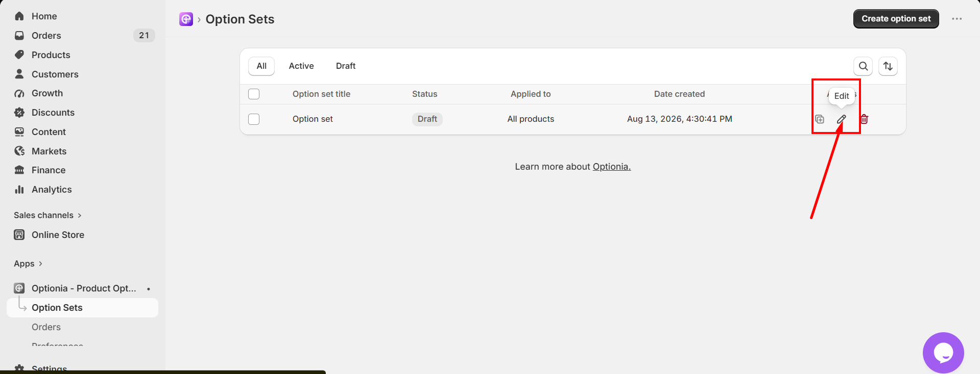
-
Click the “Add Option” button.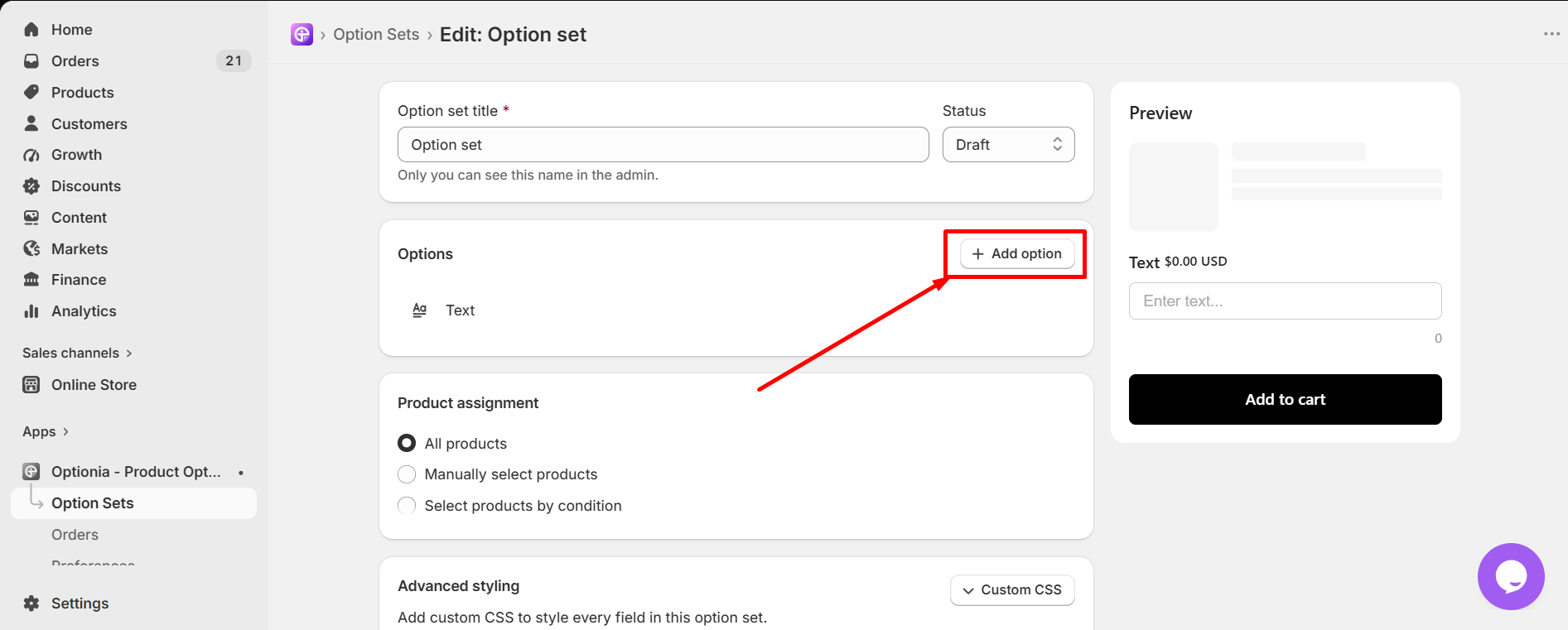
-
Select the “Dropdown” option under Single Selection.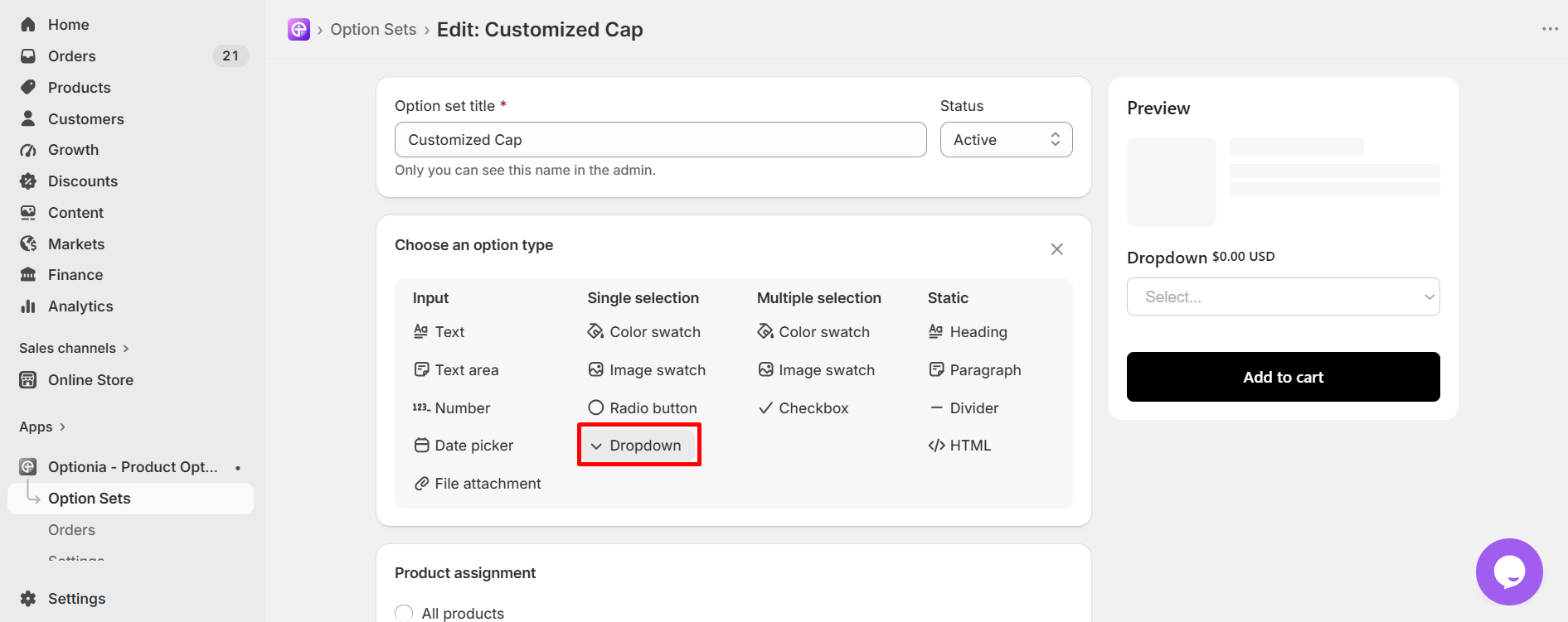
Step 2: Fulfill Required Fields
Then you can edit the single selection drop-down option as you like. Fulfill all the necessary information first: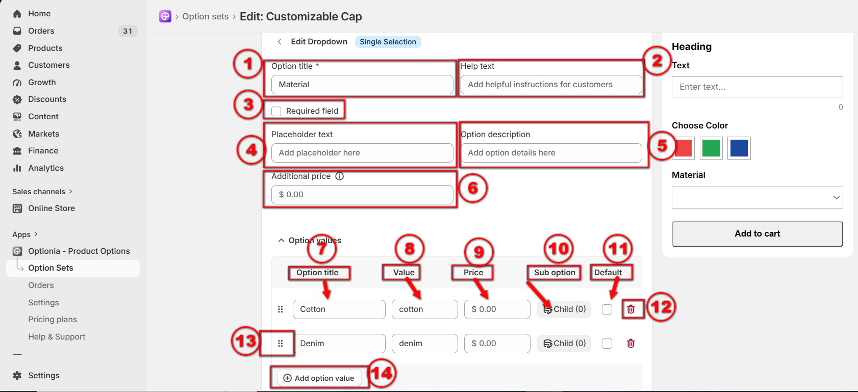
- Option title: Add or edit the option title. This is a required field, so you must add the option title.
- Help Text: Add help text to help customers with any additional information.
- Required Field: You can make an option required by selecting this field. Click on the checkbox to make an option required if you don’t want to allow customers to add the product to their cart without selecting this option.
- Placeholder: Enter the temporary text that appears inside the input field before the customer selects any option from the drop-down list.
- Option Description: You can add a description in this field to clarify what kind of information to add.
- Additional Price: You can set a fixed extra price for this drop-down option. This price will be charged once when the customer selects this option.
- Option Title: Provide a name for the options attribute here.
- Value: You can provide a value for the attribute here.
- Price: If you want to charge extra for the option, put the added price here, which will be added to your base product price.
- Sub-option: If you want to add a conditional option, you can use this. It will create a Child Option for that particular dropdown option value. Then you need to add details to it, just like a new option.
- Default: Check the box to set an attribute as the default. It will be shown as the default attribute on the product page.
- Delete: Click on the red trash icon to remove the options attribute, including all of its conditional child options (if any).
- Reorder: Click and drag this dotted icon to rearrange attributes.
- Add option value: Click here to add more option values for this option. You can add multiple values by clicking on this button.
Step 3: Personalize The Appearance
After you are done with the essential settings, scroll down to find the “Additional Settings”. Optionia lets you style each option however you like.
In the Additional Settings, stylize: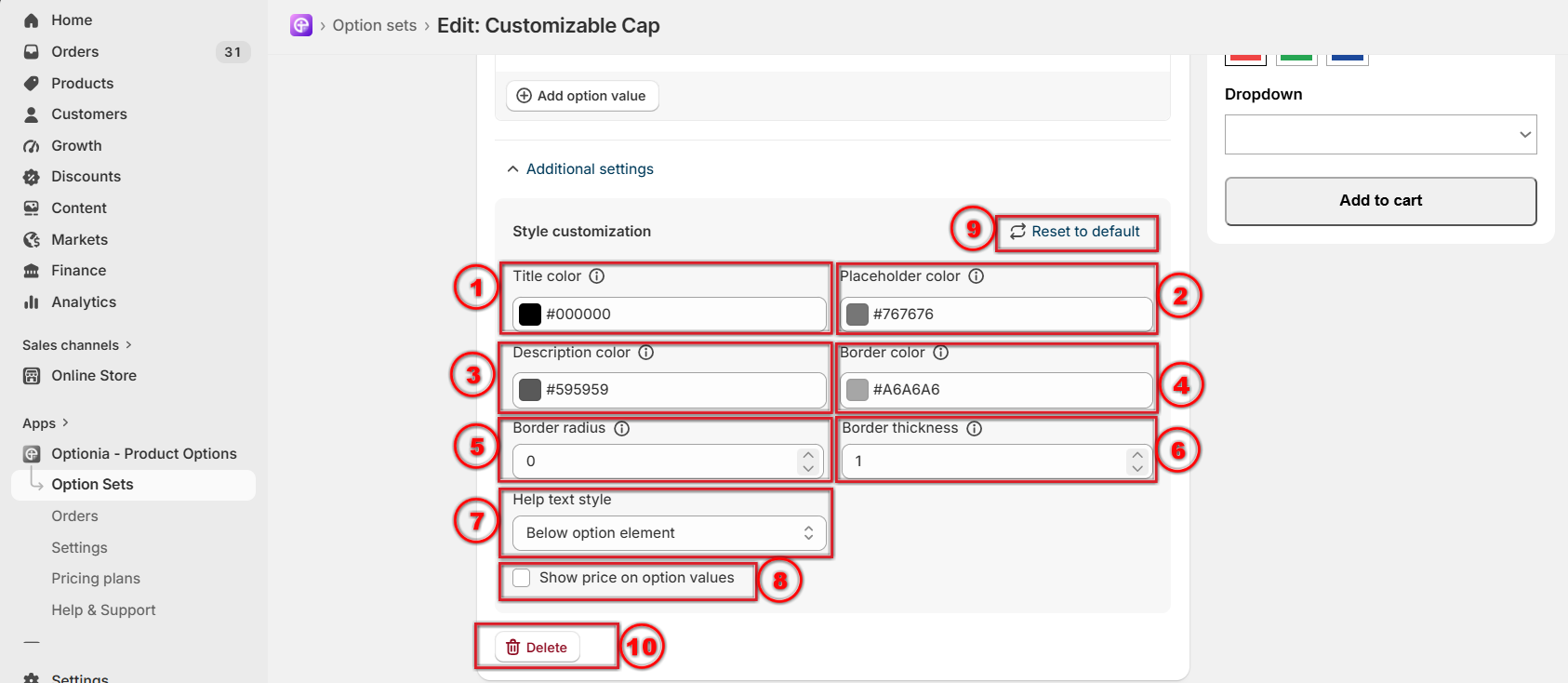
- Title color: This defines the color of the option title or label shown above the field.
- Placeholder color: This sets the color of the placeholder text inside the input field.
- Description color: This changes the color of the description text displayed below the title.
- Border color: This sets the color of the input field border.
- Border radius: This controls how rounded the corners of the input field are. Higher values create rounder corners, while lower values make them sharper.
- Border thickness: This adjusts the width of the input field border in pixels
Help text style: This setting controls where the help text is displayed in relation to the option element. You can choose from the following options:
Above Option Element: Displays the help text above the option elements next to the option title as a tooltip message.
Below Option Element: Displays the help text below the option element.
No Help Text: Hides the help text completely.
- Show price on option values: If you want to display the additional price of the option, check the “Show Price with Option Value” checkbox. When enabled, the additional price will be displayed next to the option title in both the preview and storefront.
- Reset to default: This restores all style settings in this section to their default values.
- Delete: Removes this option permanently.
Bring your brand’s vibe to the option sets with additional stylization.
Save, Discard
When editing an option, you can use Save & Discard to manage your changes and the option.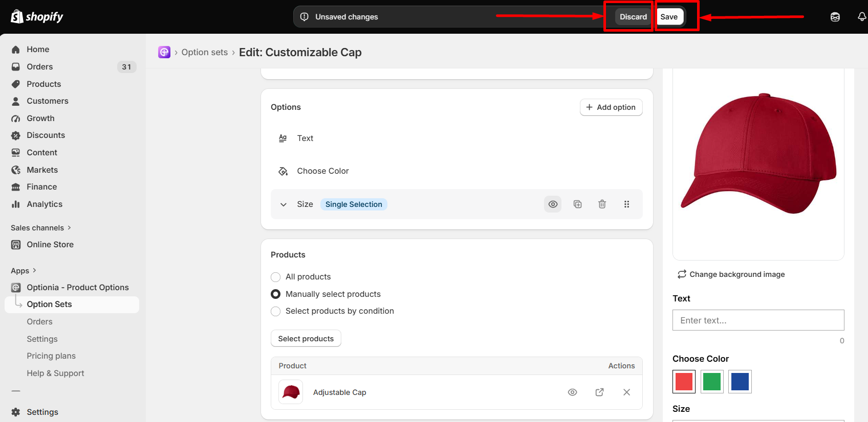
-
Save: When you are finished, click the Save button to save all the changes.
-
Discard: Click Discard to cancel all unsaved changes and return to the last saved version.
Storefront Display
After completing the configuration of the drop-down option, you can view the product options in your storefront. The drop-down option will display on the product page as shown in the image below.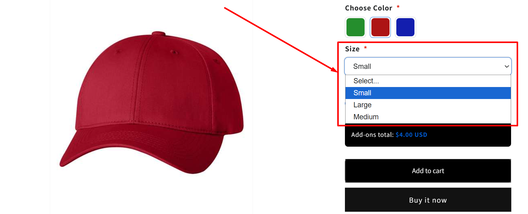
Need Help?
If you have any questions or need assistance, we will be happy to help.
 Getting Started
 Option Sets
 Orders
 Settings
 Configuration
 Live Preview
 Packages
 Help & Support
 Price Add-Ons
 Conditional Logic
 Design Theme Styling
 Uninstallation