An option set allows you to organize and manage all the customization options for a product in one place. With Optionia, you can create an option set from scratch and add multiple options to an option set, such as text fields, dropdowns, radio buttons, color swatches, image swatches, checkboxes, file uploads, and more.
You can configure each option according to your requirements, including adding option values, setting additional prices, making an option required, and applying conditional logic, etc. Once the option set is configured, you can assign it to one or more products and display the options on your storefront. Optionia allows you to add unlimited options to an option set.
Creating a new option set is quick and easy. Follow this step-by-step guide below to set up and configure a new option set.
After you complete the embedding process, you can go directly to the new option set page by clicking on the “Create Option Set " button.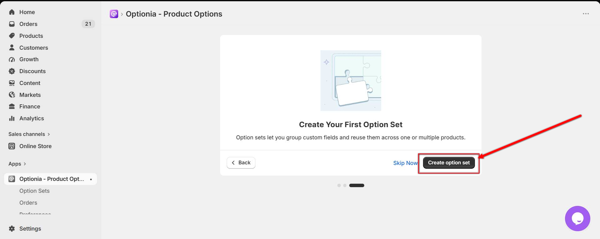
If you click on “Skip Now”, it will redirect you to the dashboard. Later, you can go to the option set page through the side navigation menu.
Click on the Option Sets tab in the left-side navigation bar.
After the Option Set page appears, click the “Create Option Set” button in the middle or top right corner. 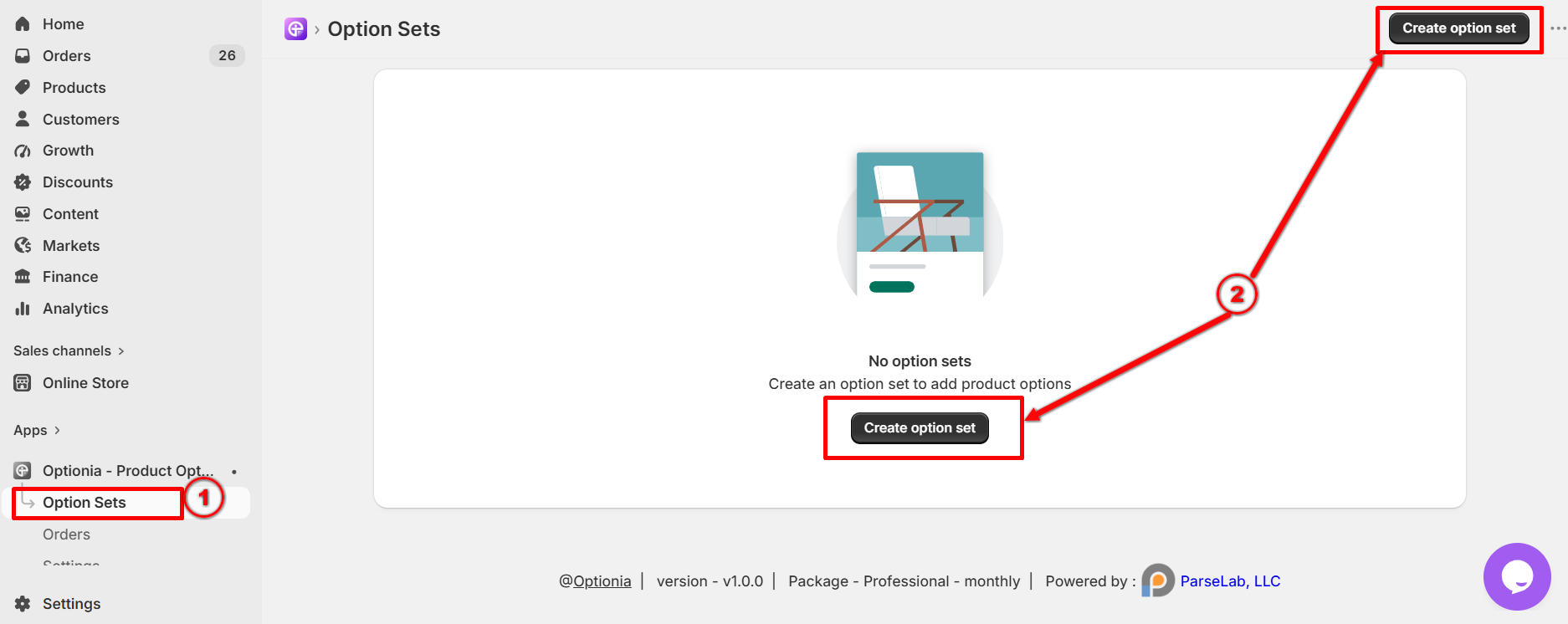
Once you are on the New Option Set page, follow the steps below to create your option sets.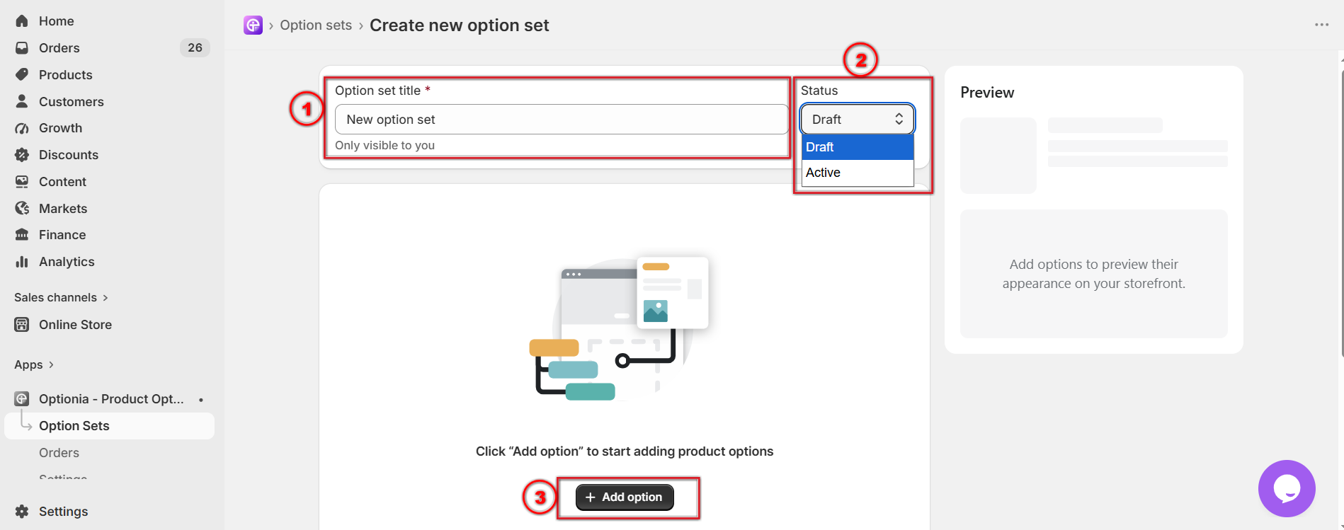
Option set title: Add or update the option set title in this field.
Status: You can change the option set status to Active or Draft. Only the active option sets will show in your storefront.
+Add Option: Optionia offers 16 impressive product options such as Text, Textarea, Number, Drop-down, Radio Button, Checkbox, File Attachment, Date Picker, Color Swatch, Image Swatch, HTML, etc.
Click on the +Add Option button to select an option and set up the option for your product.
After clicking on the +Add Option button, a window will open with 16 option types listed. Select any option set from there and configure the option for your product.
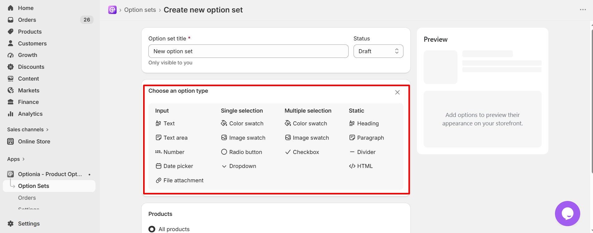
Once you have selected the option you want to add to your option set, you can configure it as you like. Each option comes with its own set of configurations.
Check the configurations of Text, Color Swatch & Drop-down options below. You will find help docs on each option type in the “Set up Option” category.
Follow the steps below to configure the text option:
Step 1: Fulfill Required Fields
After selecting Text Option, you will see the interface below to configure the available settings according to how you want customers to enter their personalized text. 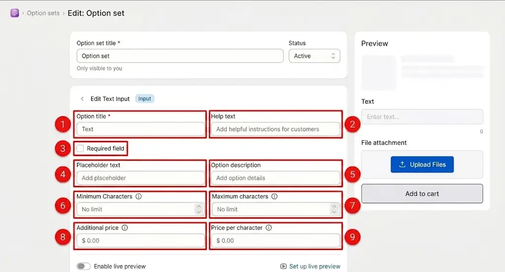
1. Option Title: Enter the name or label of the text input option that customers will see.
2. Help Text: Add additional instructions or guidance to help customers understand what they should enter in the text field.
3. Required Field: Enable this option if you want customers to enter a value before they can add the product to their cart. When enabled, customers can not proceed without completing this text field.
4. Placeholder Text: Enter the temporary text that appears inside the input field before the customer enters their own text.
The placeholder disappears automatically when the customer starts typing.
5. Option Description: Add additional information or details about the option. This can be used to explain the purpose of the field or provide extra instructions to customers.
6. Minimum Characters: Set the minimum number of characters the customer must enter. If the customer enters fewer characters than the specified minimum, they will not be able to buy/add the product to the cart. Keep the field empty if you do not want to set a minimum character requirement.
7. Maximum Characters: Set the maximum number of characters that customers are allowed to enter. Keep the field empty if you do not want to restrict the number of characters.
8. Additional Price: Set an additional fixed price that will be added when the customer enters text in this field. The additional price is charged once when the customer enters at least one character.
9. Price per Character: Set a price that will be charged for each character entered by the customer.
To configure additional settings and the live preview of the text option, check the help doc on how to set up the text option in detail.
Step 1: Fulfill Required Fields
After selecting the single selection color swatch option, you will get the interface below to configure the available settings of a color swatch option. 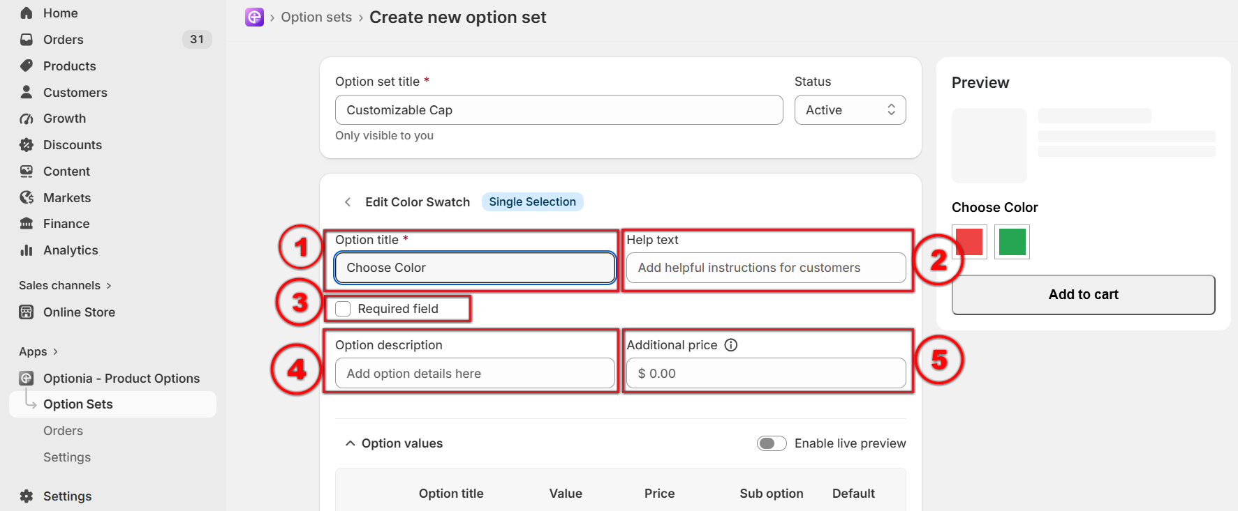
Option title: Add or edit the option title. This is a required field, so you must add the option title.
Help Text: Add help text to help customers with any additional information.
Required Field: You can make an option required by selecting this field. Click on the checkbox to make an option required if you don’t want to allow customers to add the product to their cart without selecting this option.
Option Description: You can add a description in this field to clarify the purpose of the option.
Additional Price: You can set a fixed extra price for this whole color swatch option. This price will be charged once when the customer selects this option.
Step 2: Add Option Value
Here, you will find several fields to configure the color swatch option by adding option values, selecting colors, adding a price, etc. 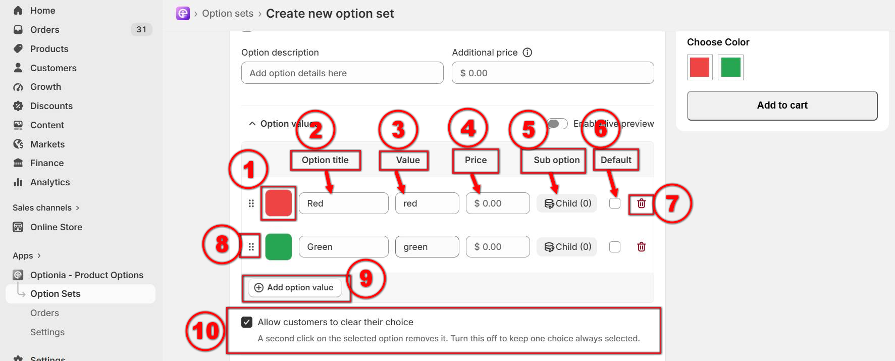
Pick a color: You can select one or two colors from here. (Click on the color box > select the Single or Multi Color option at the top > choose colors by dragging the color picker button.) 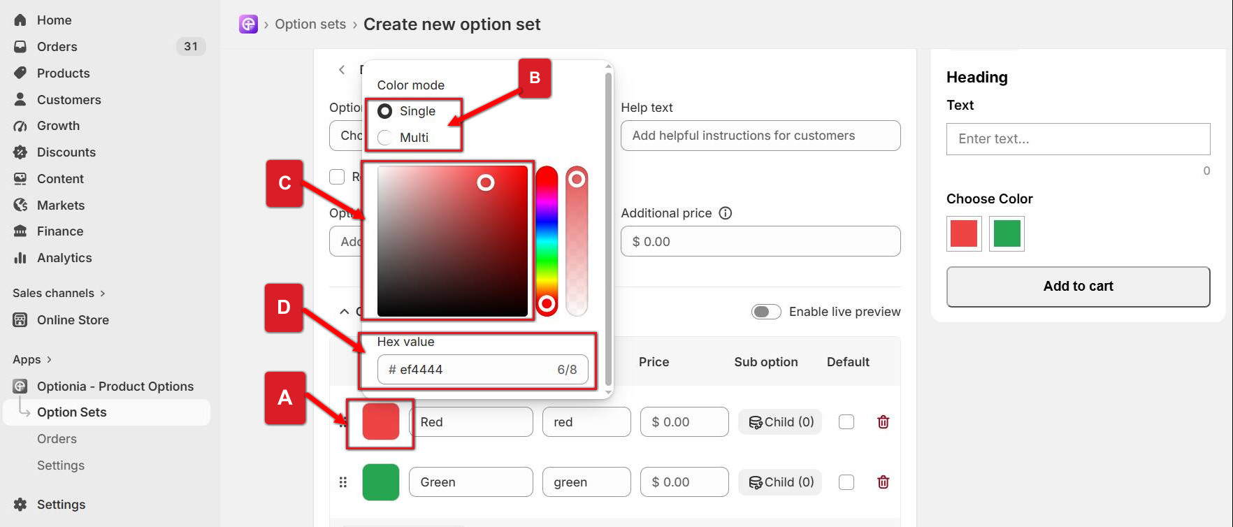
Click on the Color option value.
Select the Single or Multi Color option.
Pick a color by dragging the color picker.
You can also add the Hex value of your preferred color in the Hex Value field shown in the image below.
Option Value Title: You can add a title(Color Name) for the option value.
Value: The Value field will be updated automatically based on your option title. If you want to change the value, you can enter a new value in this field.
Price: You can set an extra price for each option value. Enter the additional amount in the Price field. This price will be added to the product’s base price when a customer selects this option value.
Sub-Option: A sub-option allows you to display additional options based on the customer’s selection in the previous option
For example, if Color is the parent option and you have Red, Blue, and Green as values, you can add Design as a child option under the Red color. When a customer selects Red, only the designs available for the red color will be displayed. Similarly, you can add different designs under Blue or Green, and those designs will appear only when the corresponding color is selected.
Default: Check the default box for a color, which will appear as the default selected color on the product page.
Delete: Click on the red trash icon to remove the option values, including all of its conditional child options (if any).
Reorder: Click and drag the dotted icon to rearrange option values.
Add option value: Click here to add another attribute. You can add multiple option values for more colors by clicking on the “Add Option Value” button.
Allow customers to clear their choice: You can allow customers a second click to deselect the selected option by enabling this field. If you turn this off, once an item is selected, it will always remain selected, and customers will not be able to deselect the option till reloads the page.
Preview: Preview will show you how the option will display on the product page. You can check the newly added color swatch option in the preview. 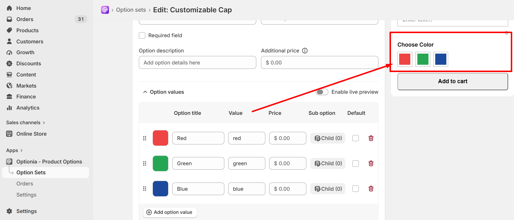
To configure additional settings and view a live preview of the single-selection color swatch option, see the help doc for detailed setup instructions.
Step 1: Fulfill Required Fields
After selecting a drop-down option, you will get the interface below to configure the available settings of a drop-down option.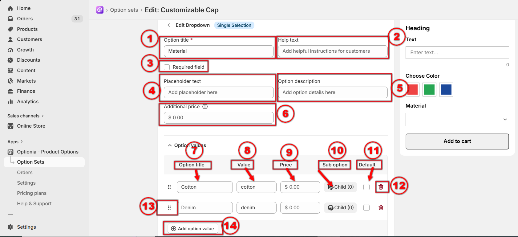
Option title: Add or edit the option title. This is a required field, so you must add the option title.
Help Text: Add help text to help customers with any additional information.
Required Field: You can make an option required by selecting this field. Click on the checkbox to make an option required if you don’t want to allow customers to add the product to their cart without selecting this option.
Placeholder: Enter the temporary text that appears inside the input field before the customer selects any option from the drop-down list.
Option Description: You can add a description in this field to clarify what kind of information to add.
Additional Price: You can set a fixed extra price for this drop-down option. This price will be charged once when the customer selects this option.
Option Value Title: Provide a name for the options attribute here.
Value: You can provide a value for the attribute here.
Price: If you want to charge extra for the option, put the added price here, which will be added to your base product price.
Sub-option: If you want to add a conditional option, you can use this. It will create a Child Option for that particular dropdown option value. Then you need to add details to it, just like a new option.
Default: Check the box to set an attribute as the default. It will be shown as the default attribute on the product page.
Delete: Click on the red trash icon to remove the options attribute, including all of its conditional child options (if any).
Reorder: Click and drag this dotted icon to rearrange attributes.
Add option value: Click here to add more option values for this option. You can add multiple values by clicking on this button.
To configure the additional settings drop-down option, check the help doc on how to set up a drop-down option in detail.
After configuring your options, you need to assign the Option Set to the products where you want the options to appear.
You can find the Product section at the bottom of the Option Set. There are three ways to apply an option set to products. You can select from any of these three: All products, Manually select products, Select products with conditions.
|
Step: Open the option set > scroll down to find the “Product” section > select any of the three radio buttons. |
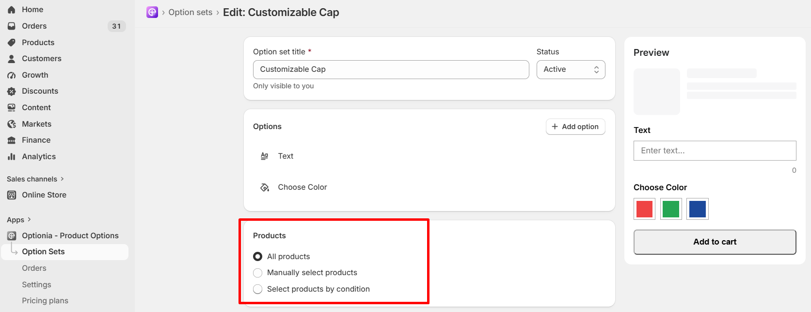
All Products: Select All Products to apply the Option Set to all products in your store automatically.
Manually Select Products: Select Manually Select Products when you want to choose specific products to which the Option Set should be applied.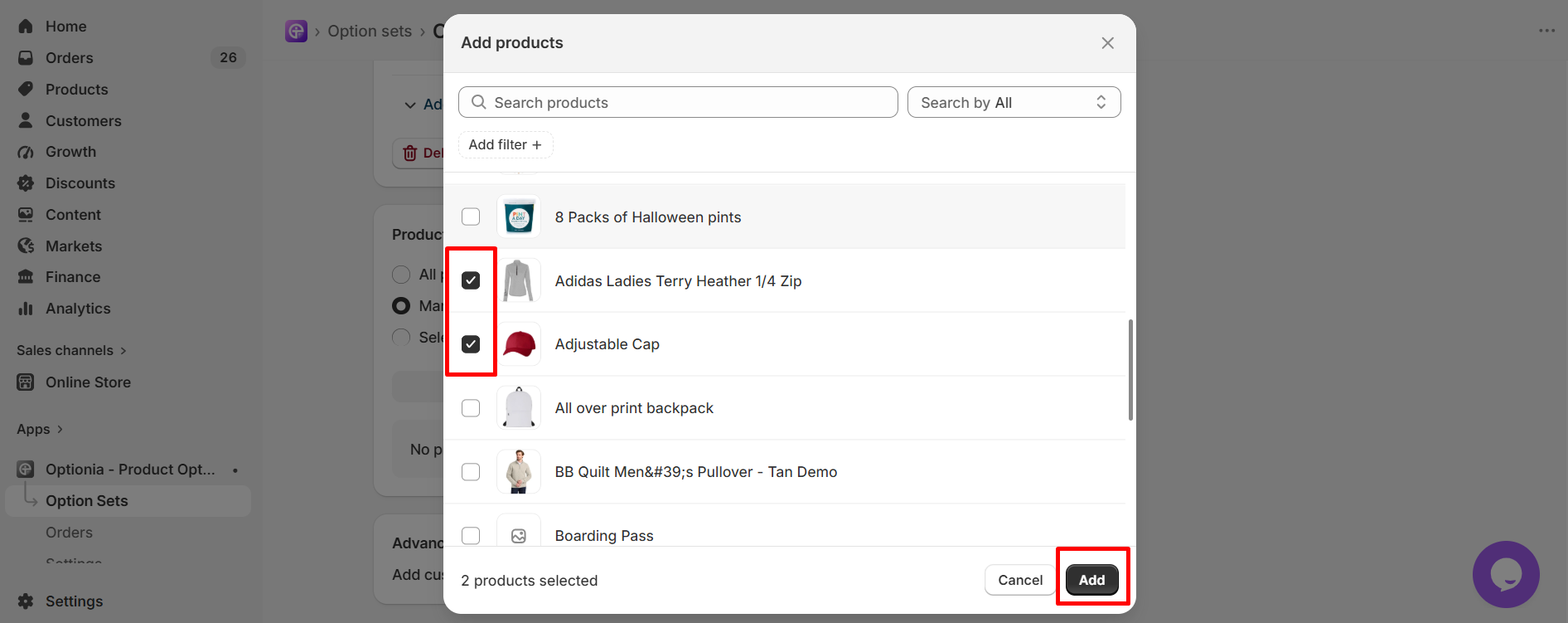 Select your preferred product from the Add product window and click on the "Add" button to apply the option set to those products.
Select Products with Conditions: Select Products with Conditions when you want to apply the Option Set based on specific product conditions automatically. Here is how you can set conditions: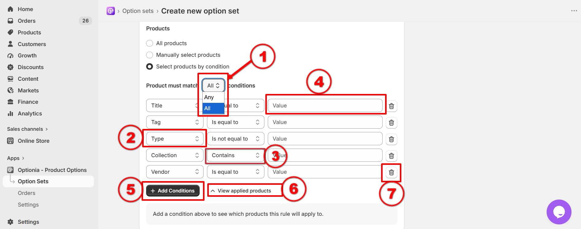
If you set multiple conditions, you can either match all the conditions or any one or two of them. Set the “products must match” option to All or Any.
ALL: A product must satisfy every single condition listed in the rows below to get this option set.
ANY: A product only needs to satisfy at least one condition from the list to get this option set.
This field is to select the product attribute type with which you want to filter the products. Available attribute types are Title, Tag, Type, Collection, and Vendor.
This field allows you to select the condition. Available conditions are Is equal to, Is not equal to, Contains, Doesn’t contain, Starts with & Ends with.
Value field will allow you to add a specific attribute name to match with your selected attribute type.
Example: If your condition is Tag is equal to, typing Bag in the Value box will target all products tagged with "Bag”.
Click on Add conditions to add more conditions row.
Clicking View applied products will show a list of products in which the option is applied after setting the condition.
Click on the trash icon to delete any conditions.
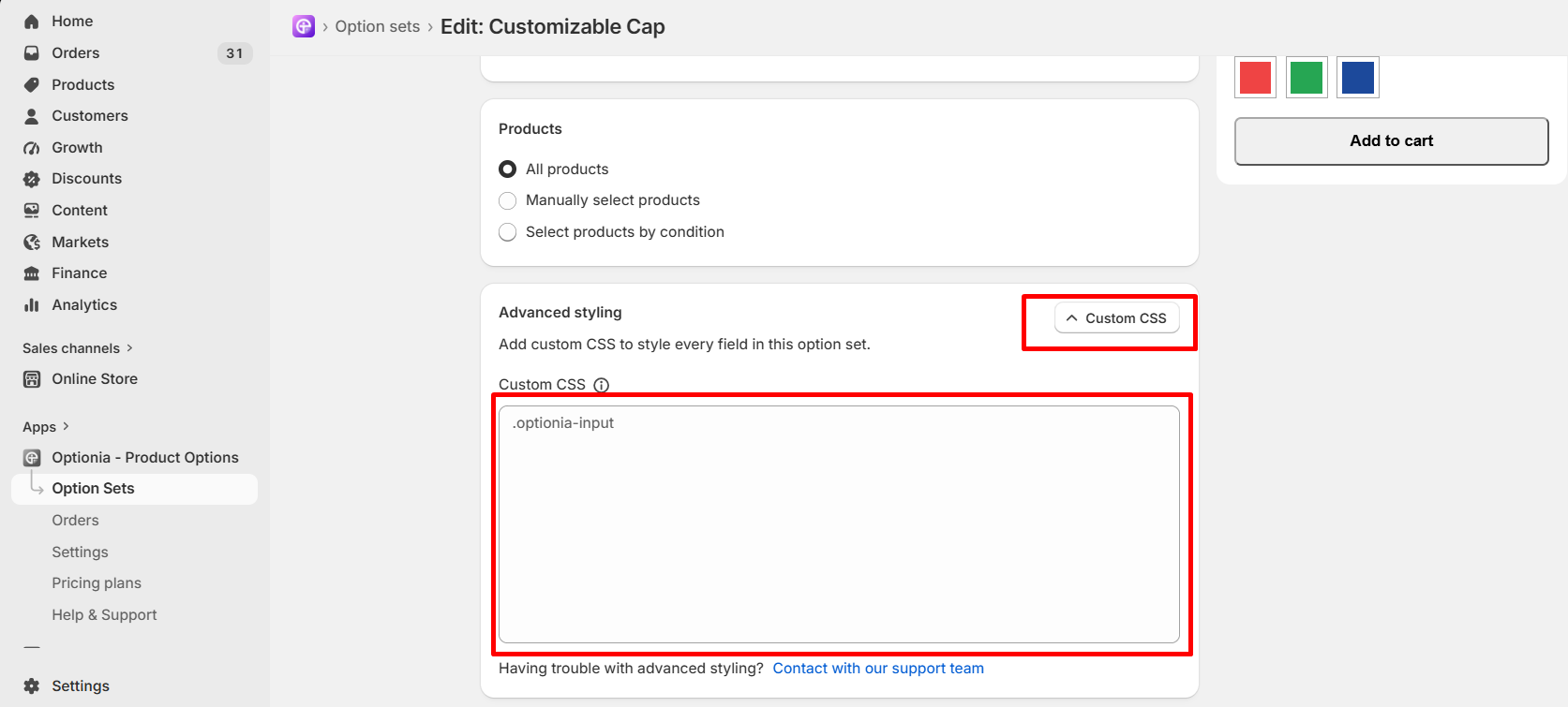
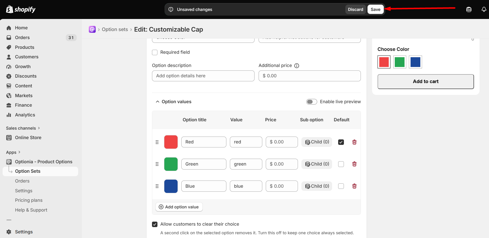
Each Optionia option set includes Advanced Styling with a Custom CSS feature. Scroll down to the option set and add your custom CSS in the input field. You can preview the changes directly in the Preview section. Once saved, the updated styling will be applied to the option set on the product page.
If you have any questions or need assistance, we will be happy to help.
Live Chat for quick assistance.
Submit a Support Ticket for detailed questions or issues.
Email: support@optionia.com
 Getting Started
 Option Sets
 Orders
 Settings
 Configuration
 Live Preview
 Packages
 Help & Support
 Price Add-Ons
 Conditional Logic
 Design Theme Styling
 Uninstallation