The Text Area option allows customers to enter longer, multi-line text when personalizing a product. It is ideal for use cases such as custom messages, instructions, notes, addresses, or other personalized content that may require more space than a standard text field.
You can control how customers enter their text by setting character limits, making the field required, and adding additional pricing. You can also customize the appearance of the Text Area and, if available on your plan, enable Live Preview so customers can see their personalized text directly on the product preview.
Follow the steps below to add and configure the Text Area option.
You can add the text option to either a completely new option set or an existing one. You can learn to create a new option set in another part. This guide explains how to add it to an existing Option Set.
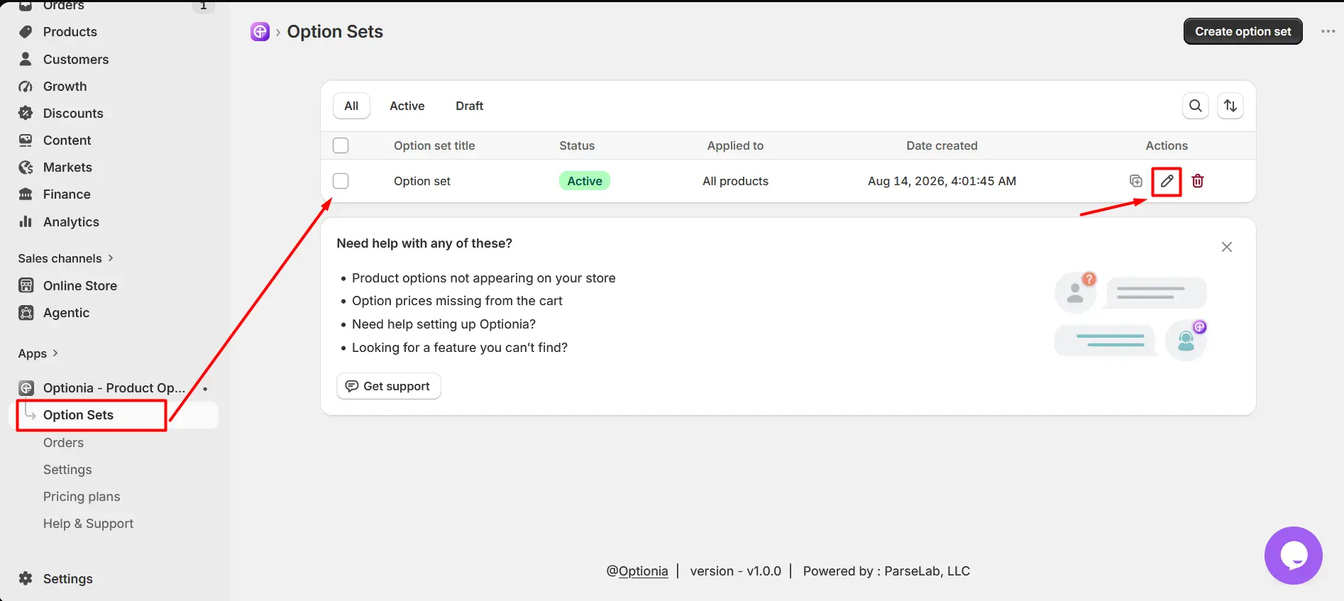
Go to an existing option set.
Click the Edit option to open it.
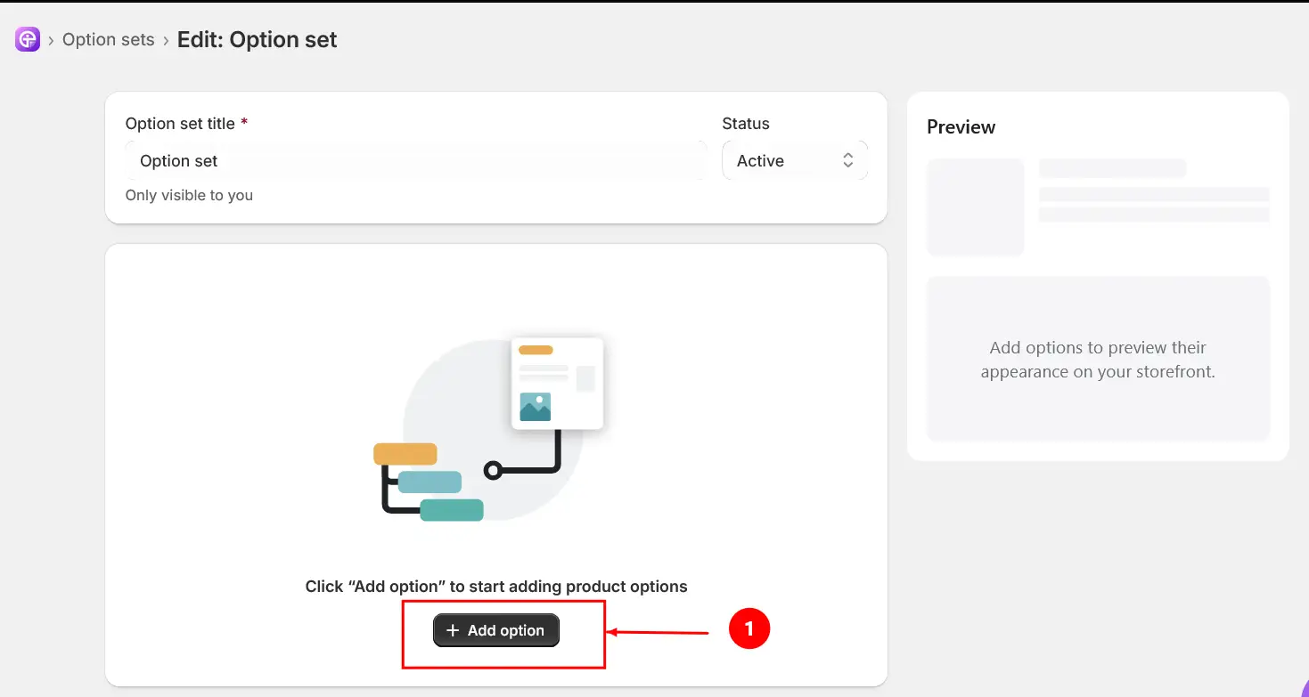
Click the “Add options” button.
Select the “Text Area” option under Inputs.
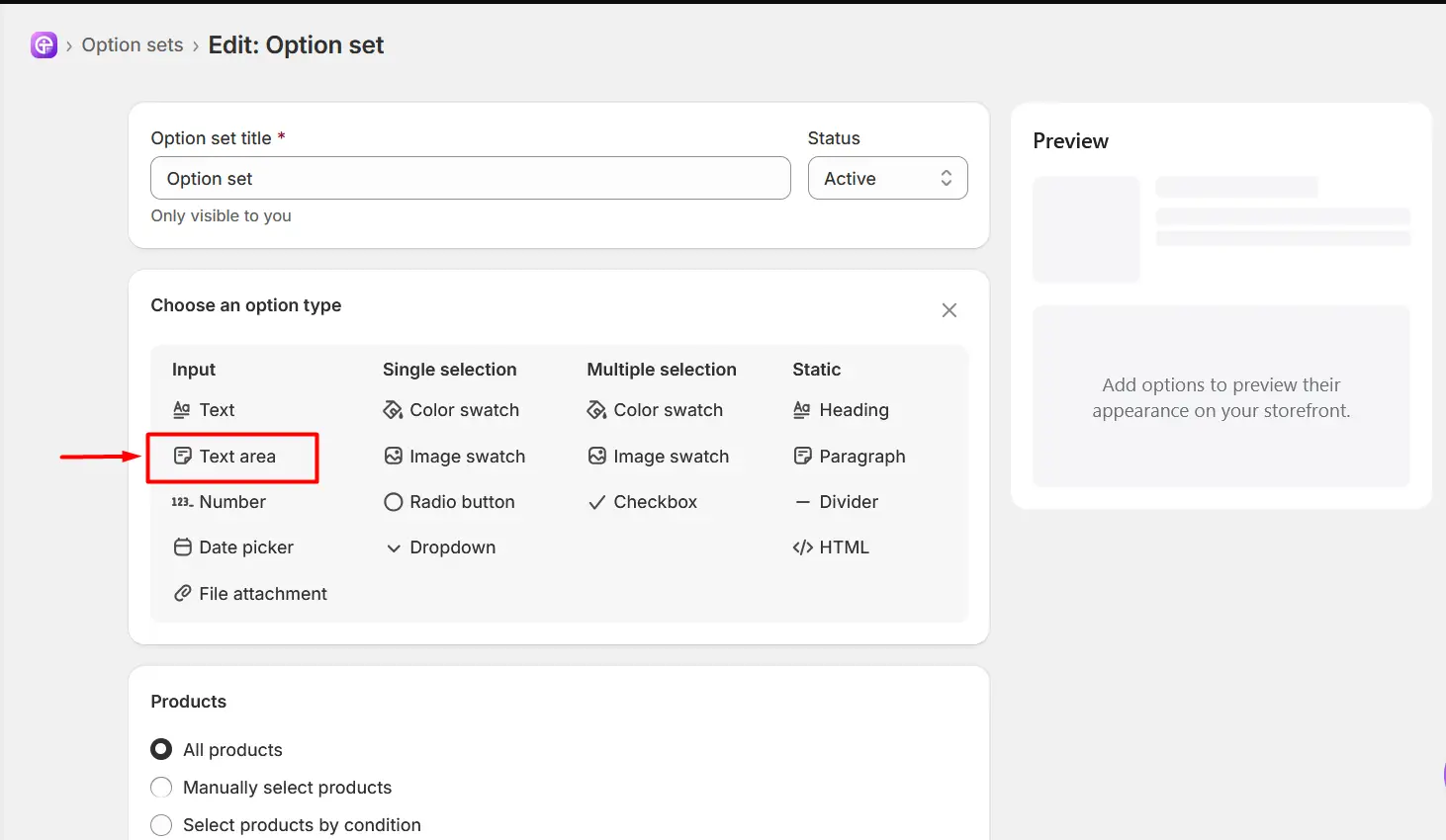
After adding the Text Area option, configure the available settings based on how you want customers to enter their personalized text.
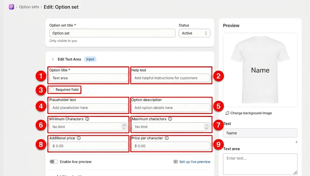
Option Title: Enter the name or label of the text input option that customers will see.
Help Text: Add additional instructions or guidance to help customers understand what they should enter in the text field.
Required Field: Enable this option if customers must enter a value before they can add the product to their cart. When enabled, customers cannot proceed without completing this text field.
Placeholder Text: Enter the temporary text that appears inside the input field before the customer enters their own text. The placeholder disappears automatically when the customer starts typing.
Option Description: Add additional information or details about the option. This can be used to explain the purpose of the field or provide extra instructions to customers.
Minimum Characters: Set the minimum number of characters the customer must enter. If the customer enters fewer characters than the specified minimum, they will not be able to buy/add to cart the product. Keep the filed blank for no limit.
Maximum Characters: Set the maximum number of characters that customers are allowed to enter. Keep the filed blank for no limit.
Additional Price: Set an additional fixed price that will be added when the customer enters text in this field. The additional price is charged when the customer enters at least one character.
Price per Character: Set a price that will be charged for each character entered by the customer.
After configuring the main settings, scroll down and expand Additional Settings.
These settings allow you to customize the appearance of the Text Area to better match your storefront design.
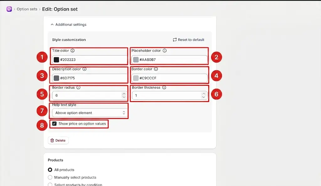
Title Color: Controls the color of the option title displayed to customers.You can change this color to match your store's design or branding.
Placeholder Color: Controls the color of the placeholder text displayed inside the text input field before the customer enters any text.
Description Color: Controls the color of the option description displayed below or around the option.
Border Color: Controls the color of the border around the text input field. You can change the border color to match your store's theme.
Border Radius: Controls how rounded the corners of the text input field are. A higher value creates more rounded corners, while a lower value creates sharper corners.
Border Thickness: Controls the thickness of the border around the text input field. A higher value makes the border thicker and more visible.
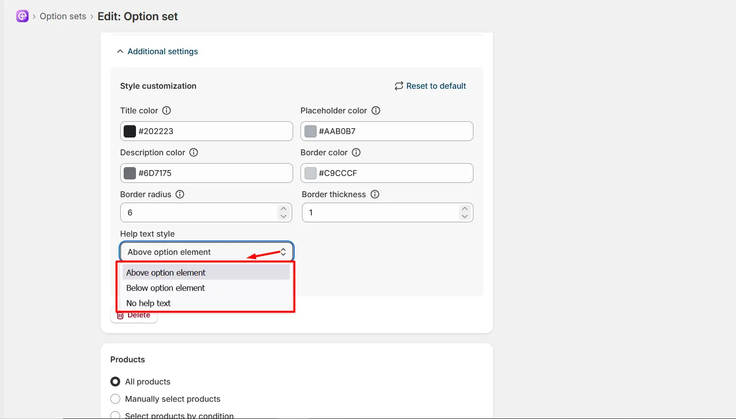
Help Text Style: The Help text style setting lets you choose how the help text for an option is displayed on your storefront. From the Help text style dropdown, you can choose:
Above option element – Displays the help text above the option.
Below option element – Displays the help text below the option.
No help text – Hides the help text from the storefront.
Show Price on Option Values: Enable this option to display the option price next to the option title on the storefront. When disabled, the option price will not be shown alongside the option title.
Live Preview is available on the Pro plan. Live Preview allows customers to see the text they enter in the Text Area directly on the product preview. This helps customers visualize how their personalized text will appear on the product before adding it to the cart.
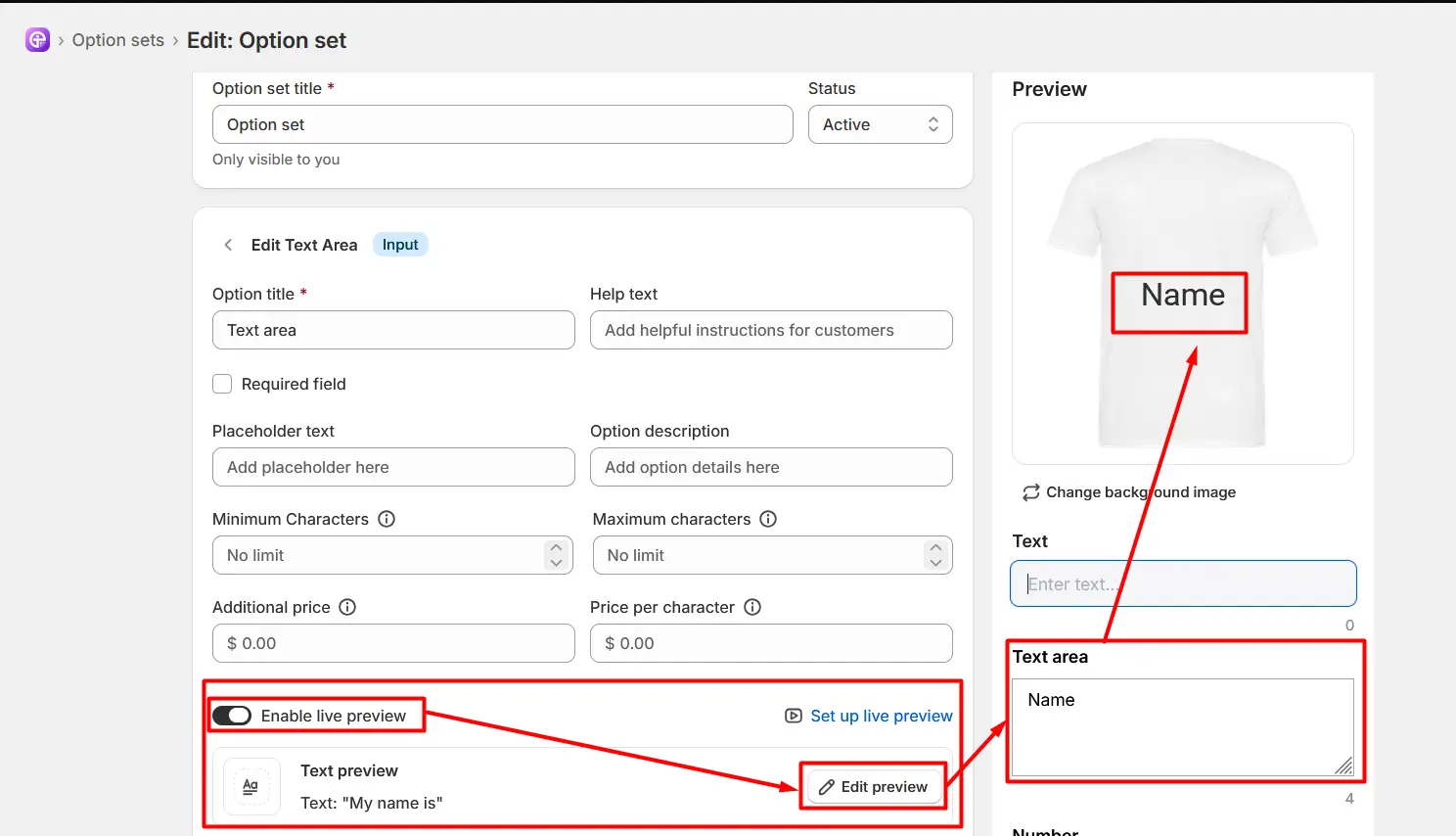
To enable Live Preview:
Open the Text Area option in your Option Set.
Turn on the Enable live preview toggle.
Click Edit preview to customize the Text Preview settings.
Use the preview editor to configure how and where the entered text appears on the product.
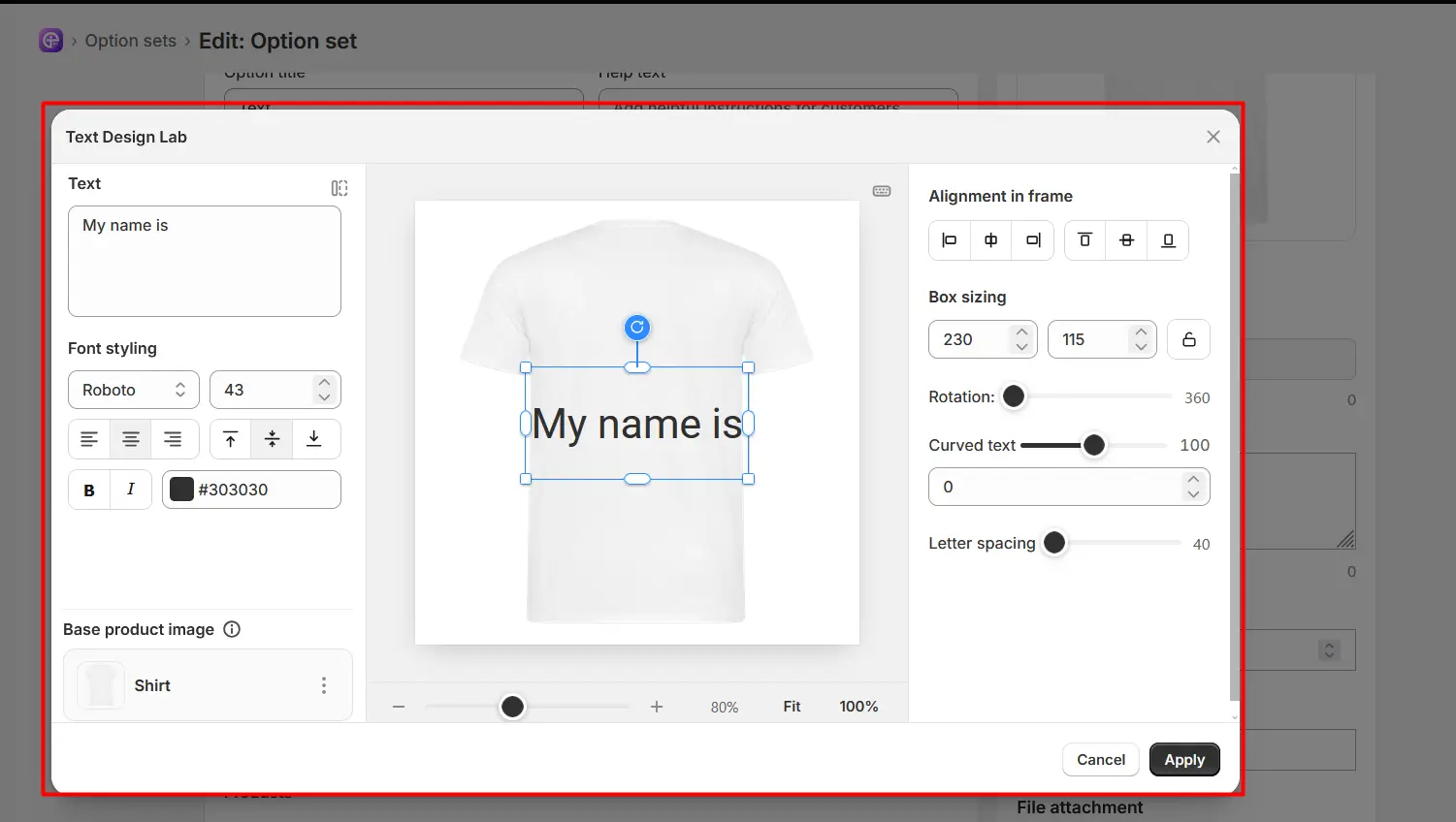
The Preview editor provides several controls to customize the appearance and position of text on the product.
Text: Enter or edit the text you want to display on the product.
Font Styling: Choose the font, font size, text alignment, bold/italic formatting, and text color.
Base Product Image: Displays the product image being used for the design. You can change the background image if you want.
Alignment in Frame: Position the text left, center, right, top, middle, or bottom within its frame.
Box Sizing: Adjust the width and height of the text box. The lock option can maintain the current proportions.
Rotation: Rotate the text to the desired angle.
Curved Text: Adjust the text curvature to create an arched or curved text effect.
Letter Spacing: Increase or decrease the spacing between individual letters.
Zoom Controls: Zoom in or out of the product preview and use Fit or 100% view.
Cancel: Discard the changes and close the Preview editor.
Apply: Save and apply the text customization.
You can find the “Products ” option at the bottom of every option set, from where you can apply the option set to any one of the three product categories.
To Assign an Option Set
Open the Option Set.
Scroll down to Productsarea.
Select one of the available assignment methods.
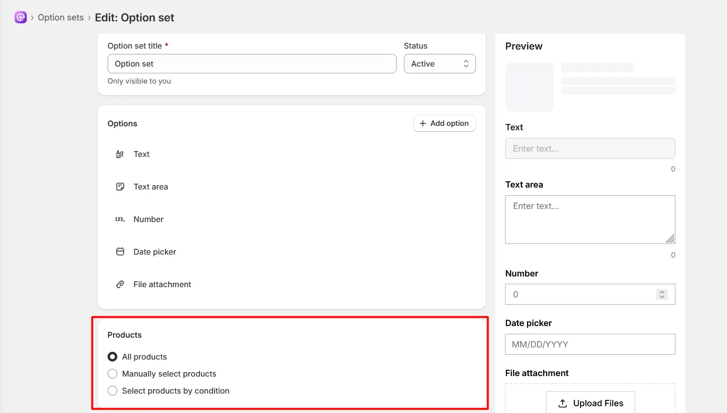
All Products: Select All Products to apply the Option Set to all products in your store.
Manually Select Products: Select Manually Select Products when you want to choose specific products to which the Option Set should be applied.
Select Products by Conditions: Select Select Products by Conditions when you want to apply the Option Set based on specific product conditions automatically.
You can use the available conditions to determine which products should receive the Option Set.
|
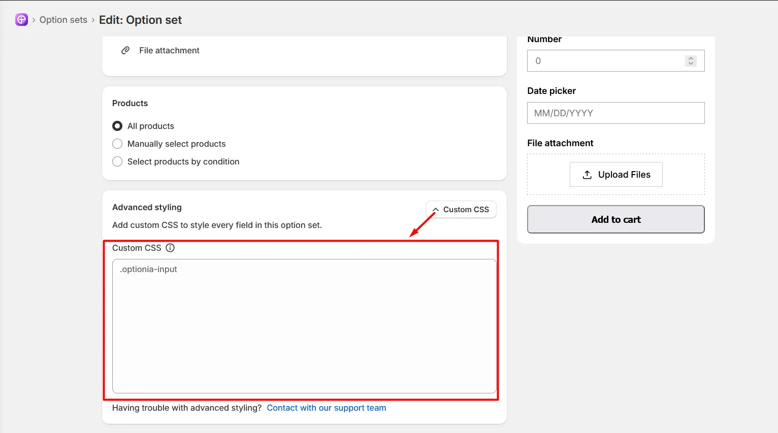
Important: Each Optionia option includes advanced styling with custom CSS. The text area option is no different; you can find the advanced styling option at the bottom.
|
|
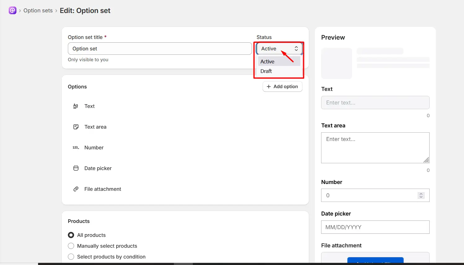
Note: When you create or edit the Option Set, it’s saved as a draft and is only visible in your dashboard. Change the status from draft to active to ensure visibility. You can see the status option right next to the Option Set title.
|
Once the Text Area is configured, the Option Set is active, and the Option Set has been assigned to the appropriate products and customers, customers can enter longer, multi-line text directly on your product pages.
If you have enabled Live Preview, customers can also see their entered text on the product preview before adding the product to their cart.
Need Help?
 Getting Started
 Option Sets
 Orders
 Settings
 Configuration
 Live Preview
 Packages
 Help & Support
 Price Add-Ons
 Conditional Logic
 Design Theme Styling
 Uninstallation