With the date picker option, you can let the customers pick a date. It can fulfill various needs: customers can choose the date they want the product delivered, see available dates ahead, or add dates to the product.
Here’s the step-by-step guide to add this option to your store:
You can add the date picker option to either a completely new option set or an existing one. You can learn to create a new option set in another part. For now, we will discuss how to add the date picker option to an existing option set.
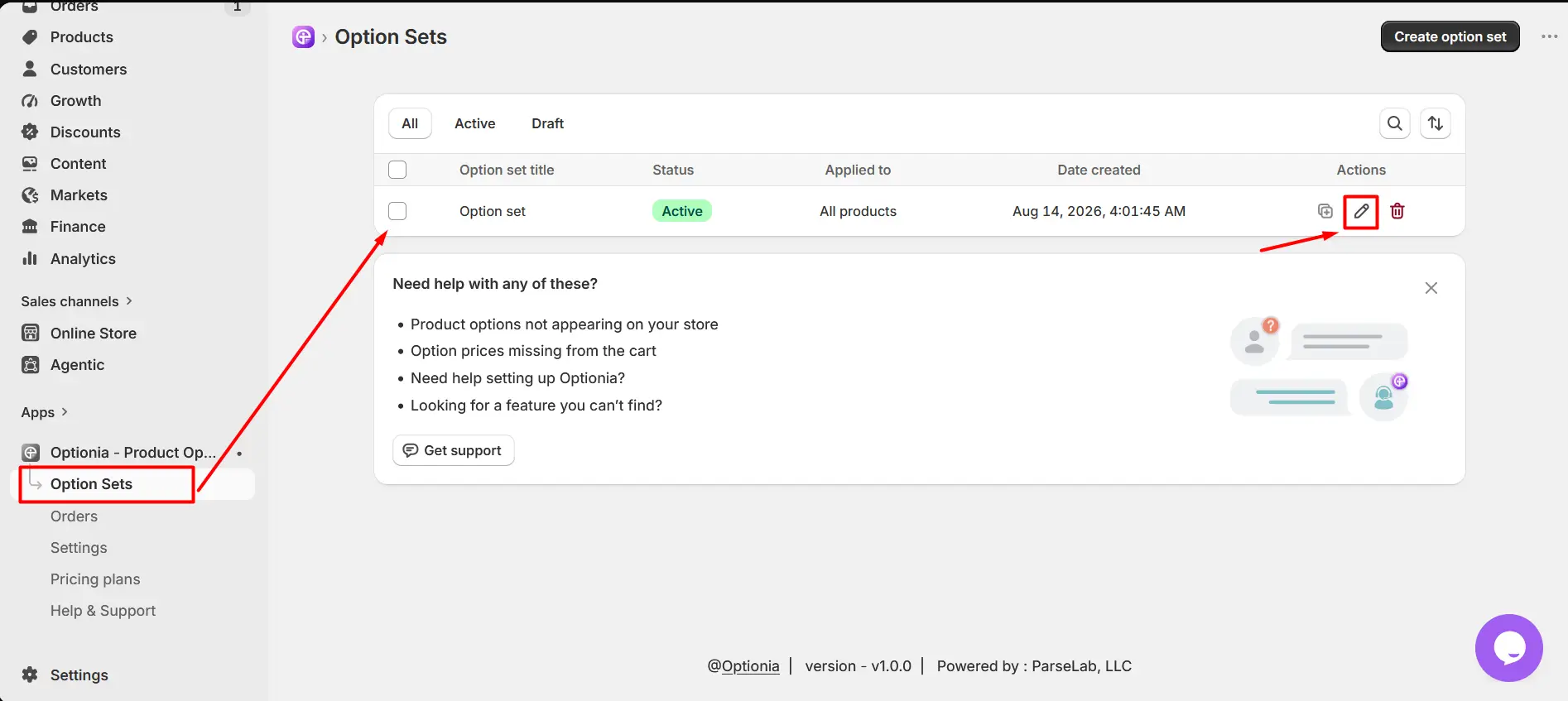
Go to an existing option set.
Click the Edit option to open it.
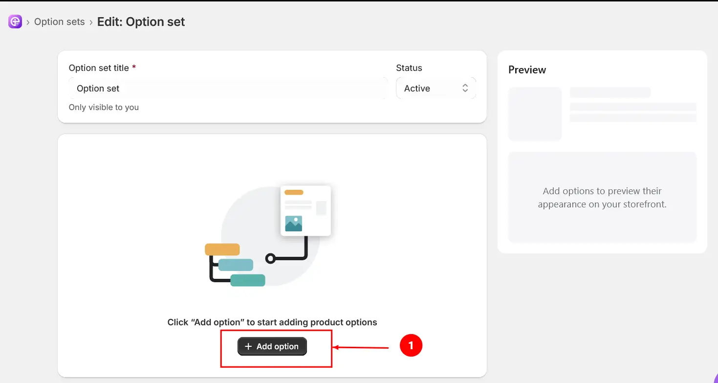
Click the “Add option” button.
Select the “Date Picker” option under Input
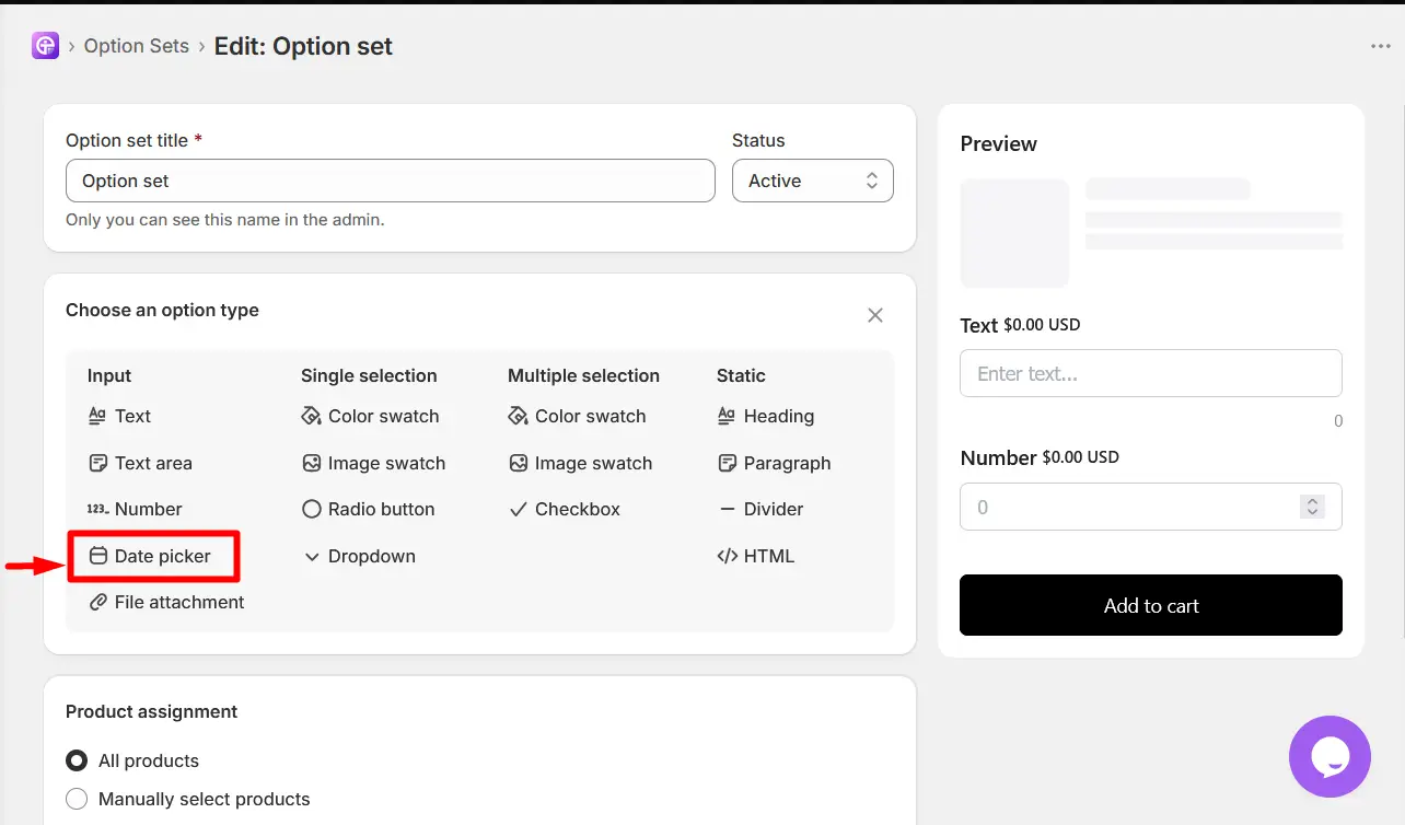
After adding the Date Picker option, configure the available settings according to how you want customers to select a date for the product.
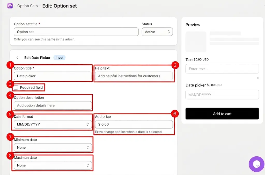
Option Title: Enter the name or label of the date picker option that customers will see.
Help Text: Add additional instructions or guidance to help customers understand which date they should select.
Required Field: Enable this option if customers must select a date before they can add the product to their cart. When enabled, customers cannot proceed without selecting a date.
Option Description: Add additional information or details about the date picker option. This can be used to explain the purpose of the field or provide extra instructions to customers.
Date Format: Select the format in which the date will be displayed and entered by customers, such as MM/DD/YYYY.
Add Price: Set an additional fixed price that will be added when the customer selects a date. The extra charge applies when a date is selected.
Minimum Date: Set the earliest date that customers are allowed to select. Customers will not be able to select a date before the specified minimum date. Select None if you do not want to set a minimum date.
Maximum Date: Set the latest date that customers are allowed to select. Customers will not be able to select a date after the specified maximum date. Select None if you do not want to set a maximum date.
After configuring the main Date Picker settings, use the Additional Settings section to customize the appearance and behavior of the option.
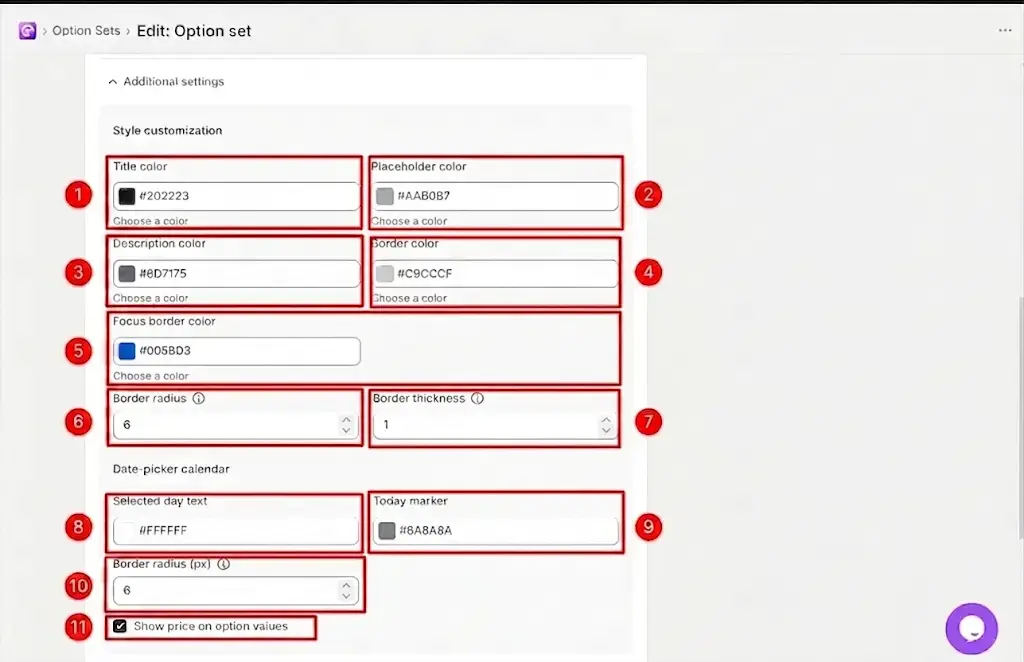
Title Color: Choose the color of the option title displayed to customers.
Placeholder Color: Choose the color of the placeholder text displayed inside the input field.
Description Color: Choose the color of the option description text.
Border Color: Choose the color of the border around the date picker input field.
Focus Border Color: Choose the color of the border displayed when the date picker field is selected or focused.
Border Radius: Set the roundness of the corners of the date picker input field. A higher value creates more rounded corners.
Border Thickness: Set the thickness of the border around the date picker input field.
Selected Day Text: Choose the text color used for the selected date in the date-picker calendar.
Today Marker: Choose the color used to indicate the current day in the date-picker calendar.
Border Radius (px): Set the corner roundness of the date-picker calendar. A higher value creates more rounded calendar corners.
Show Price on Option Values: Enable this option to display the option price next to the option title on the storefront. When disabled, the option price will not be shown alongside the option title.
You can find the “Products” section at the bottom of every option set, from where you can apply the option set to any one of the three product categories.
To Assign an Option Set
Open the Option Set.
Scroll down to Products.
Select one of the available assignment methods.
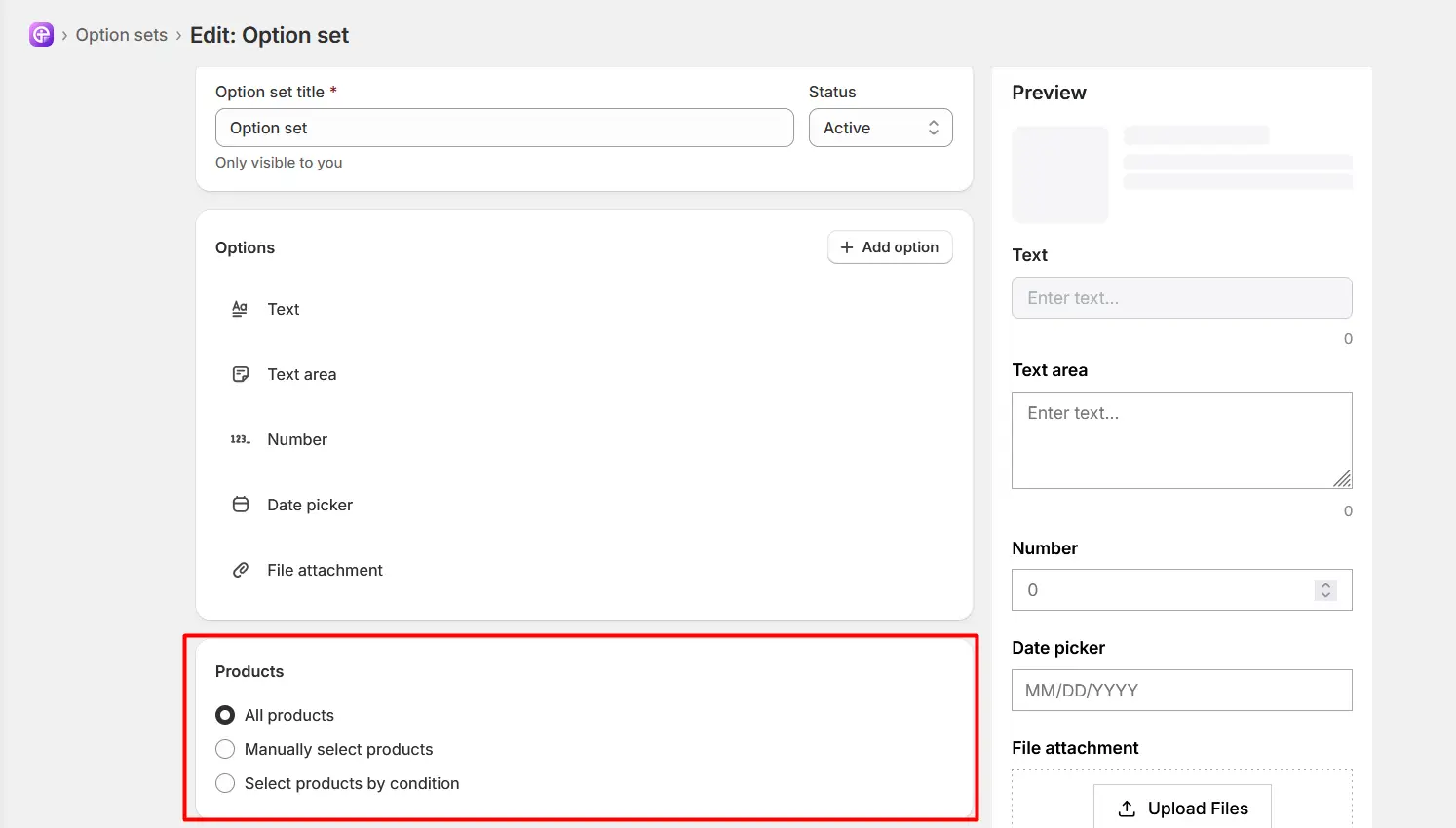
All Products: Select All Products to apply the Option Set to all products in your store.
Manually Select Products: Select Manually Select Products when you want to choose specific products to which the Option Set should be applied.
Select Products by Conditions: Select Select Products by Conditions when you want to apply the Option Set based on specific product conditions automatically.
You can use the available conditions to determine which products should receive the Option Set.
|
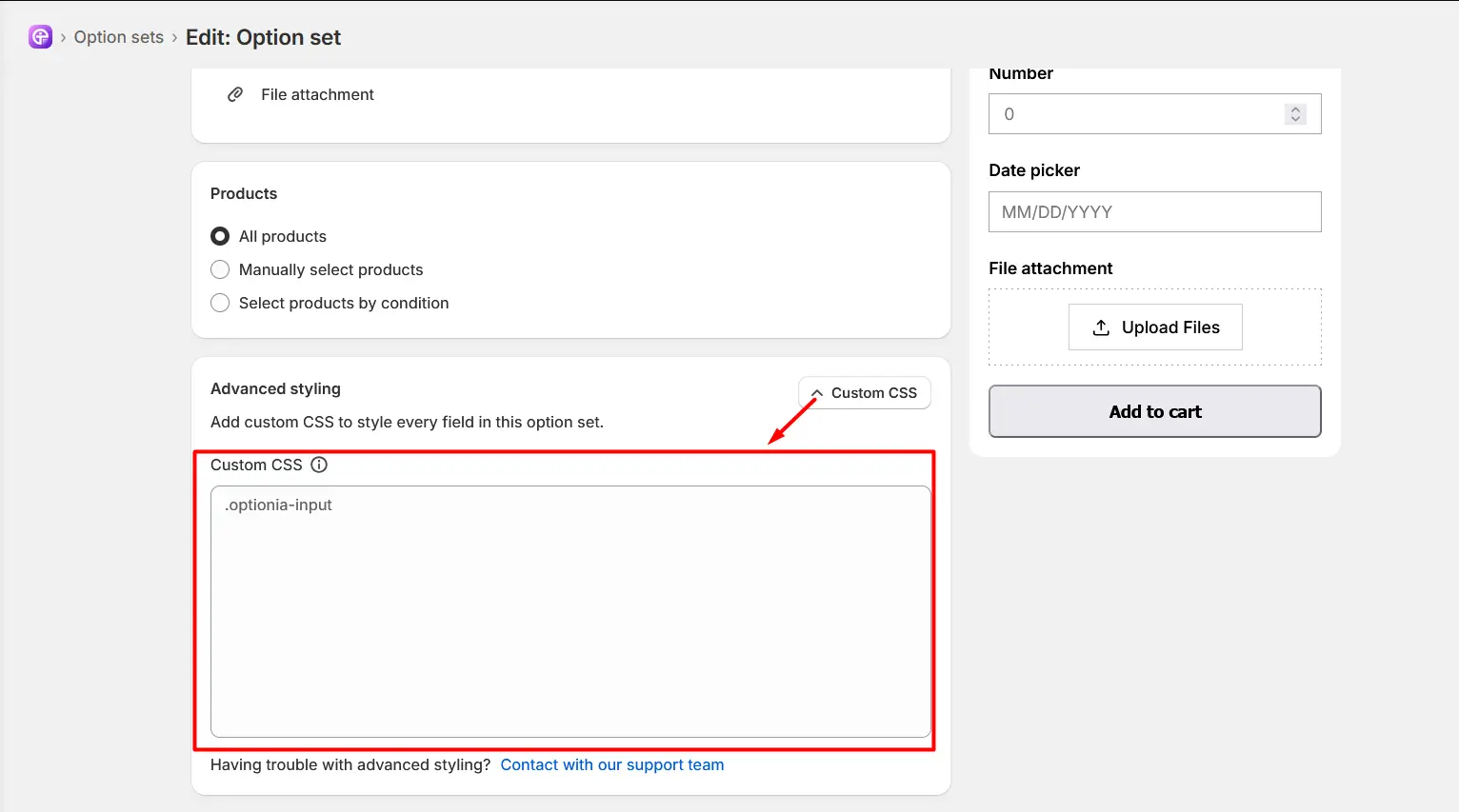
Important: Each Optionia option includes advanced styling with custom CSS. The text option is no different; you can find the advanced styling option at the bottom.
|
|
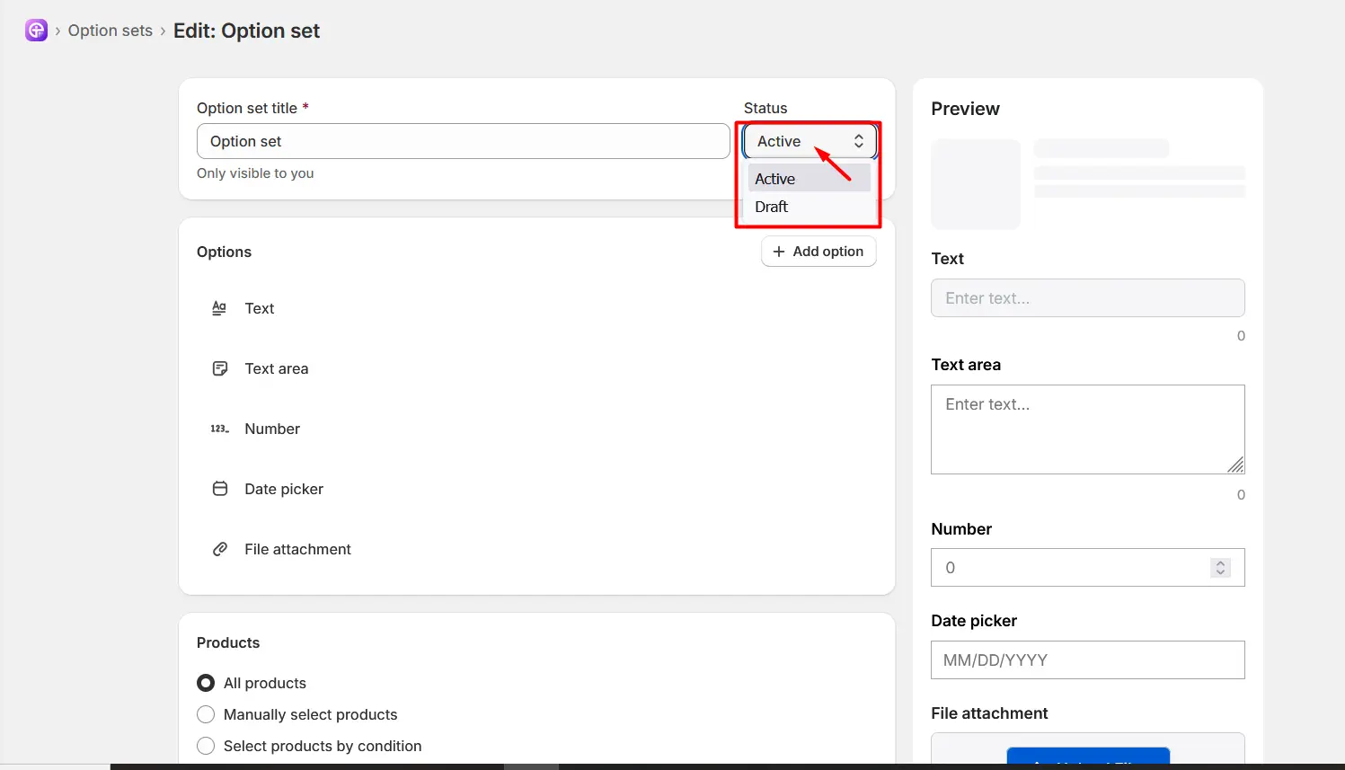
Note: When you create or edit the Option Set, it’s saved as a draft and is only visible in your dashboard. Change the status from draft to active to ensure visibility. You can see the status option right next to the Option Set title.
|
Once the Date Picker option is configured, the Option Set is active, and the Option Set has been assigned to the appropriate products, customers can select a date directly on your product pages.
Need Help?
 Getting Started
 Option Sets
 Orders
 Settings
 Configuration
 Live Preview
 Packages
 Help & Support
 Price Add-Ons
 Conditional Logic
 Design Theme Styling
 Uninstallation