The Translations section allows you to customize the text displayed to customers on your storefront. You can add languages, select the language you want to translate, and edit the customer-facing messages used by different option types.
This guide explains each section and setting available under Translations, including the supported placeholders used in dynamic messages.
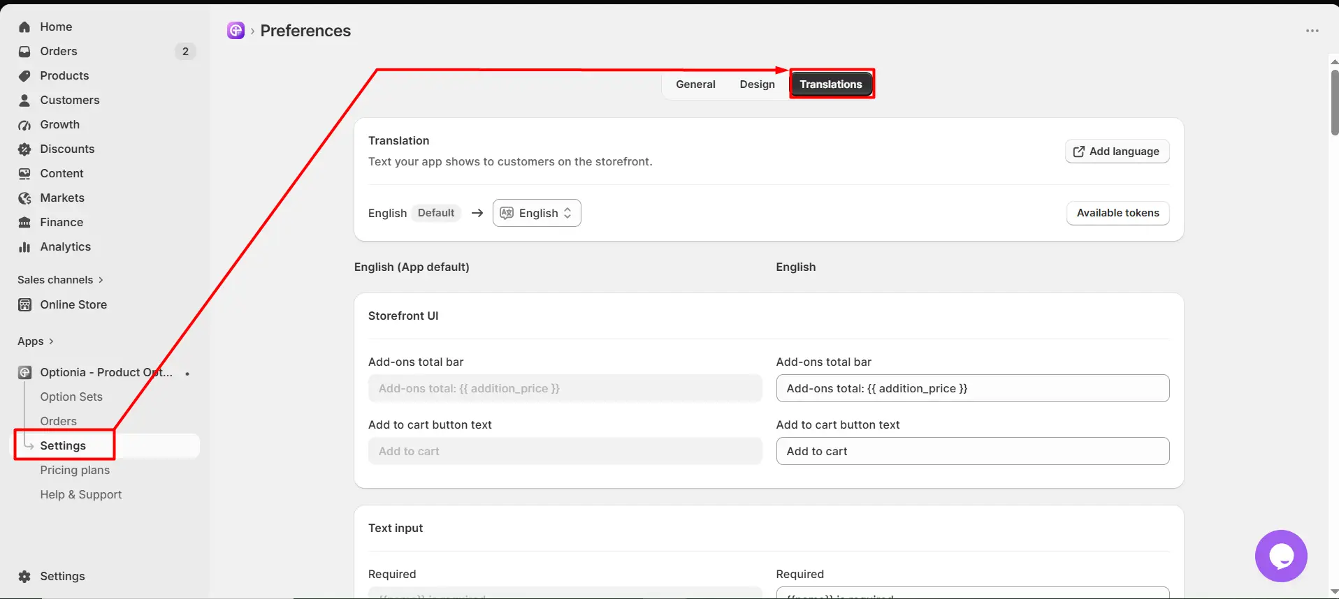
From your Shopify admin, open Optionia – Product Options.
Go to Settings.
Click the Translations tab.
The Translation section allows you to manage the languages used for your storefront text.
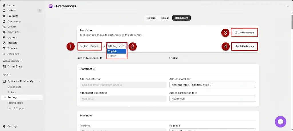
Default: Shows the default language used by the app.
Language Selector: Select the language you want to translate or customize.
Add language: Click Add language to add another language for your storefront.
Available tokens:
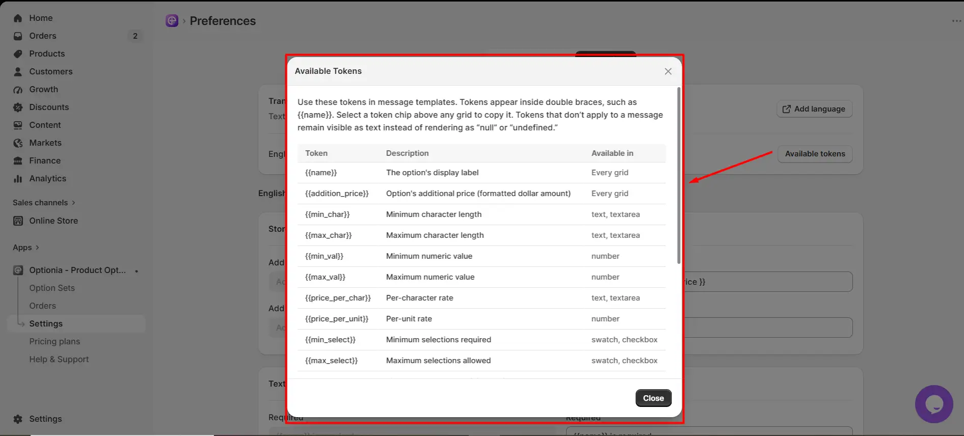
Dynamic placeholders enclosed in double curly brackets, such as {{name}}, that automatically display the relevant value in your storefront messages.
For example, {{name}} displays the option name, while {{addition_price}} displays its additional price. Other tokens provide specific values such as minimum or maximum character limits ({{min_char}}, {{max_char}}), minimum or maximum numeric values ({{min_val}}, {{max_val}}), pricing per character or unit ({{price_per_char}}, {{price_per_unit}}), and minimum or maximum selections ({{min_select}}, {{max_select}}). Use each token exactly as provided and only with the option types it supports.
Click Available tokens to view the dynamic placeholders that can be used in translation messages.
The Storefront UI section contains text that appears in common storefront elements.
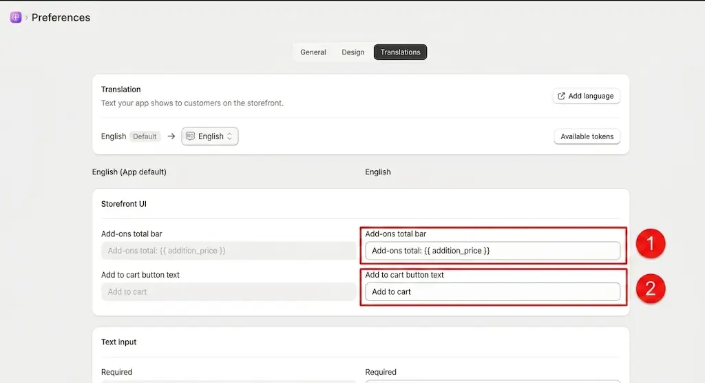
Add-ons Total Bar
Add-ons total bar: Controls the text displayed in the bar showing the total additional price of selected options.
{{addition_price}} Displays the calculated additional price automatically.
Add to Cart Button
Add to cart button text: Controls the text displayed on the Add to Cart button.
The Text input section controls validation messages and price labels for text input options.
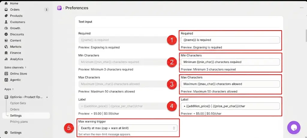
Required: Message displayed when the customer leaves a required text field empty. {{name}} Displays the name of the option automatically.
Min Characters: Message displayed when the customer enters fewer characters than the configured minimum.
{{min_char}} Displays the minimum number of characters configured for the option.
Max Characters: Message displayed when the customer exceeds the configured maximum number of characters.
{{max_char}} Displays the maximum number of characters allowed.
Label: Controls the label used to display additional pricing for the text input. {{addition_price}} Displays the additional price applied to the option.
{{price_per_char}} Displays the additional price charged per character.
Max warning trigger: Determines when the maximum-character warning message is displayed.
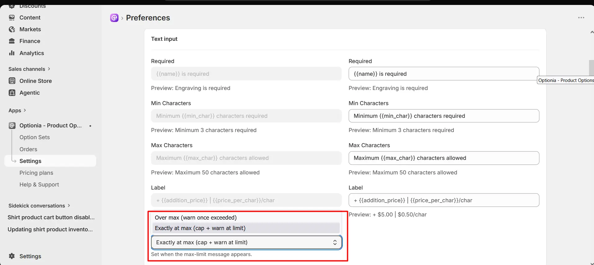
Over max (warn once exceeded): Allows customers to type past the character threshold, but displays a validation warning message only after they exceed the allowed maximum limit.
Exactly at max (cap + warn at limit): Prevents customers from typing any further once the maximum character limit is reached, displaying a warning right as they touch the cap.
The Textarea section provides translation settings for multi-line text fields.
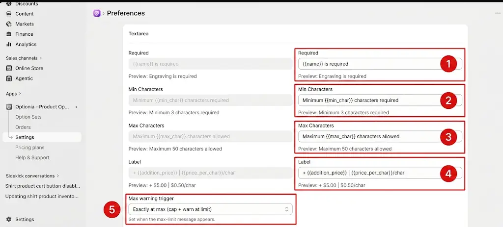
Required: Message displayed when a required textarea is left empty.
{{name}} Displays the name of the textarea option.
Min Characters: Message displayed when the entered text does not meet the minimum character requirement.
{{min_char}} Displays the configured minimum character limit.
Max Characters: Message displayed when the entered text exceeds the maximum character limit.
{{max_char}} Displays the configured maximum character limit.
Label: Controls the label displayed with the textarea's additional price.
{{addition_price}} Displays the additional price for the textarea.
{{price_per_char}} Displays the price charged per character.
Max warning trigger: Determines when the maximum-character warning is displayed. The available setting shown is Over max (warn once exceeded).
Over max (warn once exceeded): Allows customers to type past the character threshold, but displays a validation warning message only after they exceed the allowed maximum limit.
Exactly at max (cap + warn at limit): Prevents customers from typing any further once the maximum character limit is reached, displaying a warning right as they touch the cap.
The Number input section controls messages and labels for number-based options.
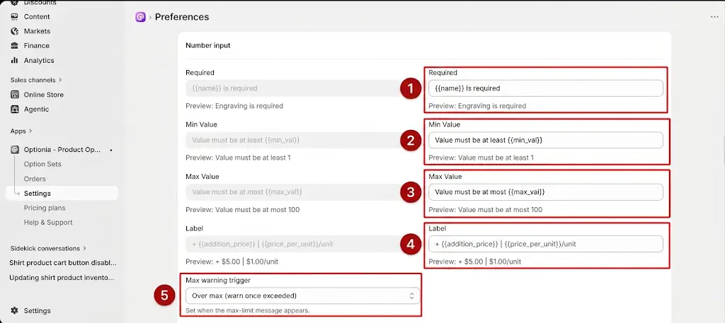
Required: Message displayed when a required number field is left empty.
{{name}} Displays the name of the number option.
Min Value: Message displayed when the entered number is lower than the configured minimum.
{{min_val}} Displays the configured minimum value.
Max Value: Message displayed when the entered number is higher than the configured maximum.
{{max_val}} Displays the configured maximum value.
Label: Controls the label used to display additional pricing for the number input.
{{addition_price}} Displays the additional price applied to the option.
{{price_per_unit}} Displays the additional price charged per unit
Max warning trigger: Determines when the maximum-value warning message is displayed. The available setting shown is Over max (warn once exceeded).
Over max (warn once exceeded): Allows customers to type past the character threshold, but displays a validation warning message only after they exceed the allowed maximum limit.
Exactly at max (cap + warn at limit): Prevents customers from typing any further once the maximum character limit is reached, displaying a warning right as they touch the cap.
The Swatch section controls validation messages and pricing text for swatch-based options.
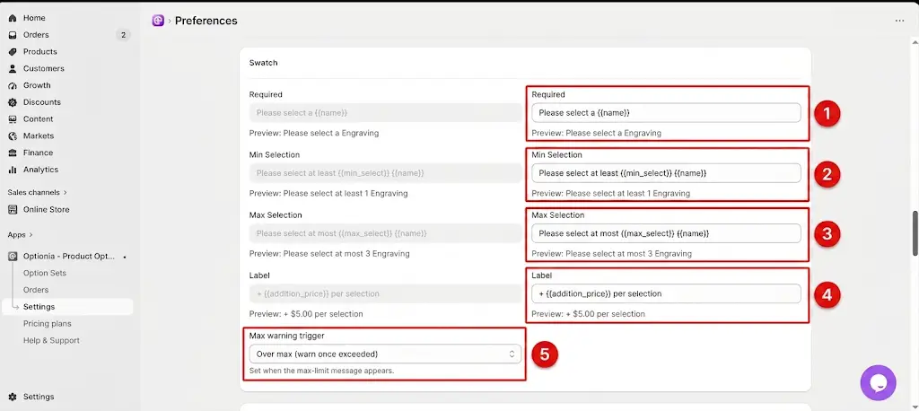
Required: Message displayed when the customer does not select a required swatch.
{{name}} Displays the name of the swatch option.
Min Selection: Message displayed when the customer selects fewer swatches than required.
{{min_select}} Displays the minimum number of selections allowed.
Max Selection: Message displayed when the customer selects more swatches than allowed.
{{max_select}} Displays the maximum number of selections allowed.
Label: Controls the label displayed with the swatch's additional price.
{{addition_price}} Displays the additional price for the selection.
Max warning trigger: Determines when the maximum-selection warning is displayed. The available setting shown is Over max (warn once exceeded).
The Radio + dropdown section controls the messages and price label used for radio button and dropdown options.
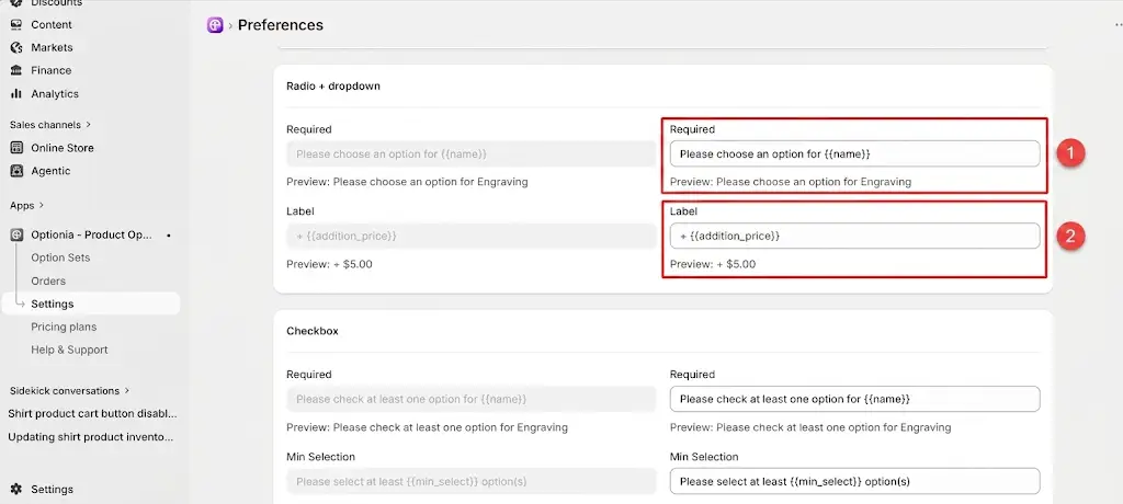
Required: Message displayed when the customer does not select a required option.
{{name}} Displays the name of the option that requires a selection.
Label: Controls the text used to display the additional price for the selected option.
{{addition_price}} Displays the additional price applied to the selected option.
The Checkbox section controls validation messages and pricing labels for checkbox options.
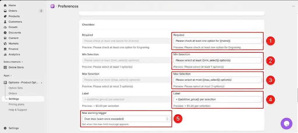
Required: Message displayed when the customer does not make the required checkbox selection.
{{name}} Displays the name of the checkbox option.
Min Selection: Message displayed when the customer selects fewer options than the minimum required.
{{min_select}} Displays the minimum number of selections required.
Max Selection: Message displayed when the customer selects more options than allowed.
{{max_select}} Displays the maximum number of selections allowed.
Label: Controls the label displayed with the additional price.
{{addition_price}} Displays the additional price for the selected option.
Max warning trigger: Determines when the maximum-selection warning appears. The available setting shown is Over max (warn once exceeded).
The Date Picker section controls validation messages and price labels for date-based options.
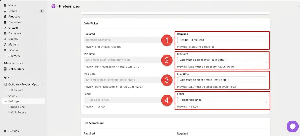
Required: Message displayed when a required date is not selected.
{{name}} Displays the name of the date option.
Min Date: Message displayed when the selected date is earlier than the configured minimum date.
{{min_date}} Displays the configured minimum date.
Max Date: Message displayed when the selected date is later than the configured maximum date.
{{max_date}} Displays the configured maximum date.
Label: Controls the label displayed with the additional price for the date option.
{{addition_price}} Displays the additional price applied to the date option.
The File Attachment section controls the messages and labels displayed when customers upload files.
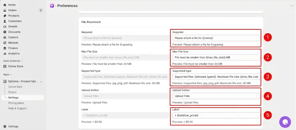
Required: Message displayed when a required file has not been uploaded.
{{name}} Displays the name of the file attachment option.
Max File Size: Message displayed when the uploaded file exceeds the configured size limit.
{{max_file_size}} Displays the maximum file size allowed.
Supported type: Message that informs customers about the supported file types and maximum file size.
{{allowed_types}} Displays the file types allowed for upload.
{{max_file_size}} Displays the maximum file size allowed.
Upload button: Controls the text displayed on the file upload button.
Label: Controls the label displayed with the additional price for the file attachment option.
{{addition_price}} Displays the additional price applied to the file attachment.
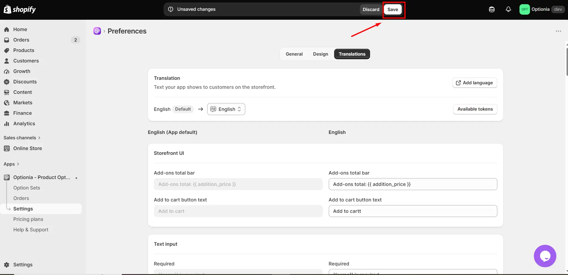
Review your changes. Make sure all translated text and dynamic tokens are entered correctly.
Click the Save button to apply and save your translation changes.
The Translations section gives you control over the customer-facing text used throughout Optionia. You can translate general storefront messages as well as validation messages for Text Input, Textarea, Number Input, Swatch, Radio, Dropdown, Checkbox, Date Picker, and File Attachment options.
For dynamic messages, always keep the required tokens intact. This allows Optionia to automatically insert values such as option names, character limits, selection limits, dates, file limits, and additional prices when the message is shown to customers.
Need Help?
 Getting Started
 Option Sets
 Orders
 Settings
 Configuration
 Live Preview
 Packages
 Help & Support
 Price Add-Ons
 Conditional Logic
 Design Theme Styling
 Uninstallation