The Design tab allows you to customize the appearance and layout of your product options on the storefront. You can select a predefined theme, customize colors, borders, spacing, option layouts, tooltips, buttons, additional prices, and other visual elements. You can also add custom CSS for advanced styling.
This guide explains each setting available in the Design tab and how to configure it.
From your app dashboard, go to Settings.
Click Design.
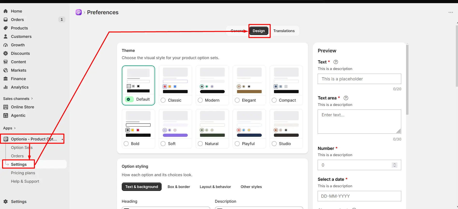
The Design tab contains the following sections:
Theme
Option styling
Storefront Surfaces
Custom CSS
Configure each section according to the appearance you want on your storefront.
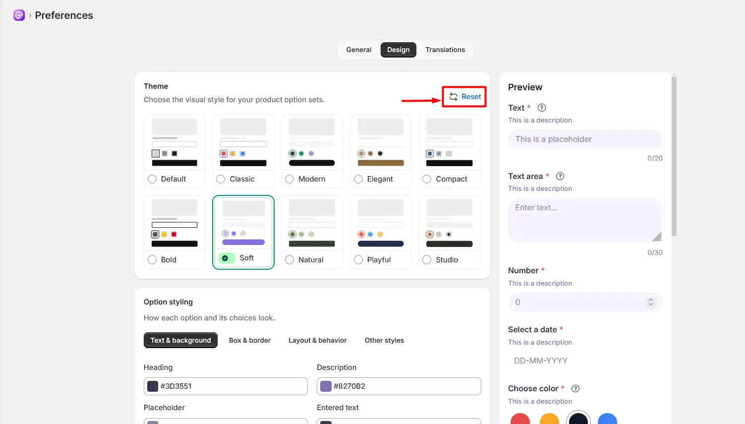
The Theme section provides 10 pre-designed themes that you can use to quickly customize the appearance of your product options. Each theme comes with its own predefined colors, spacing, and visual styling.
The available themes include:
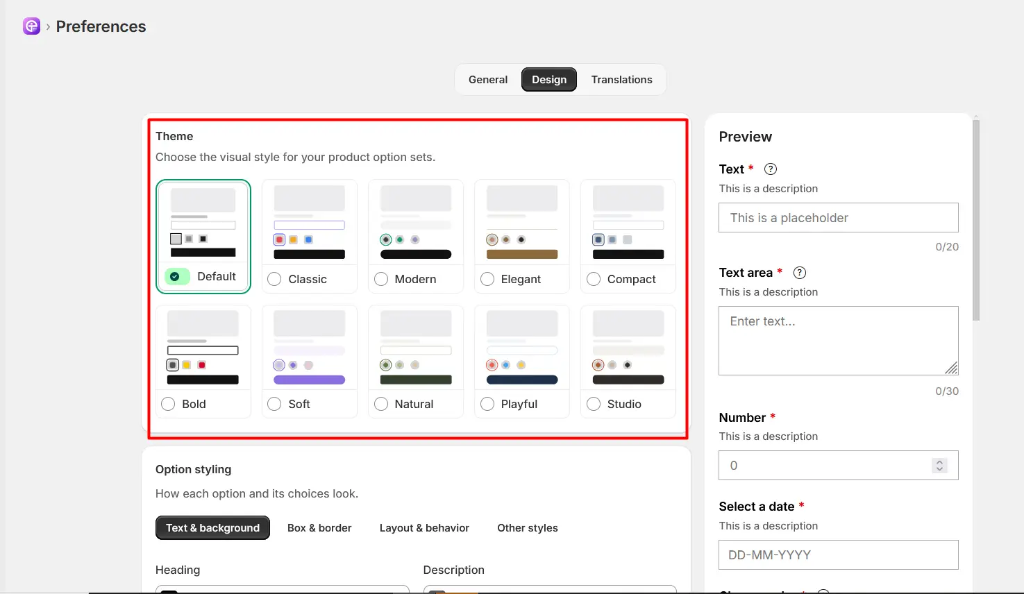
Default: A clean and neutral style with balanced spacing.
Classic: A traditional style with a simple and familiar appearance.
Modern: A contemporary style with a clean and modern look.
Elegant: A refined style with a polished appearance.
Compact: A compact layout designed to use less space.
Bold: A stronger visual style with more prominent elements.
Soft: A softer appearance with subtle colors and rounded styling.
Natural: A natural-looking style with muted colors.
Playful: A colorful and friendly visual style.
Studio: A clean, professional style suitable for a modern storefront.
How to Select a Theme
Review the available theme cards.
Click the theme you want to use.
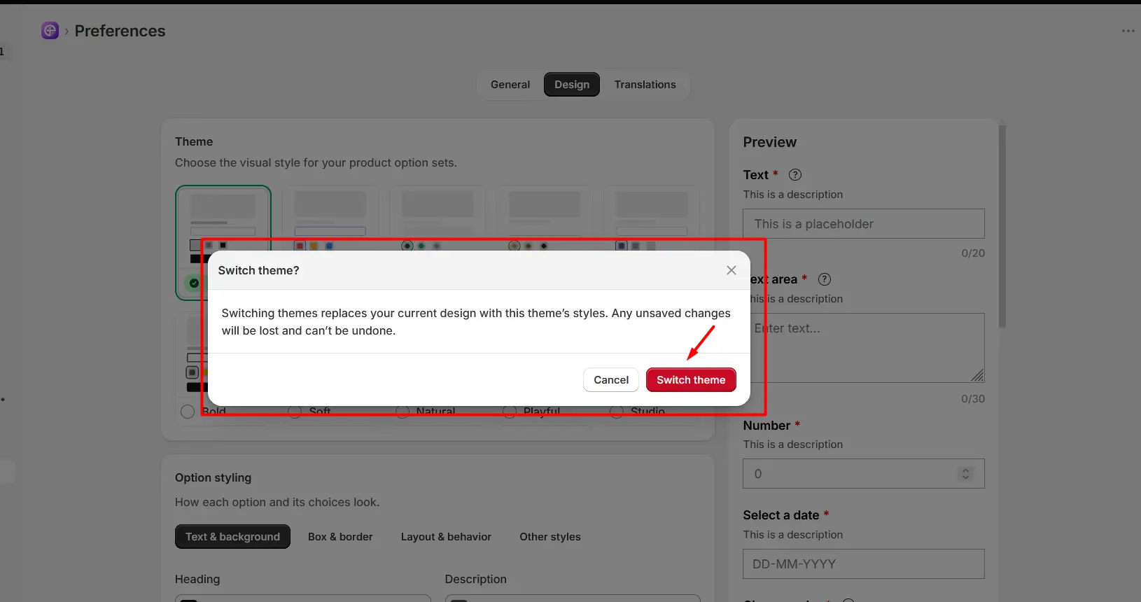
A “Switch theme?” confirmation window will appear. After that, click the Switch theme button to apply the selected theme. Click Cancel to keep your current theme.
Switching themes replaces your current design settings with the selected theme’s styles. Any unsaved changes will be lost and can not be undone.
The selected theme is indicated by the selection indicator.
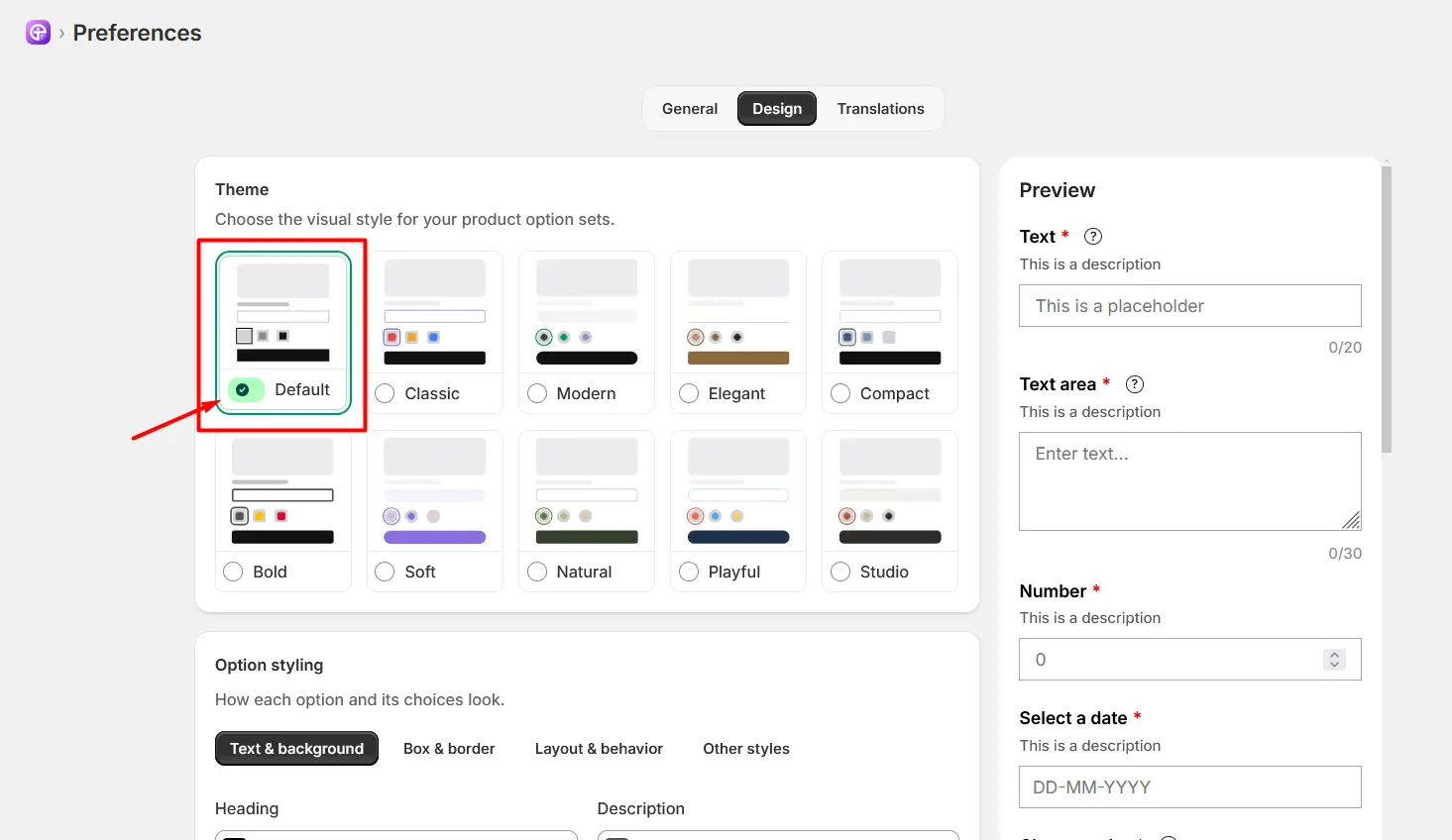
Use the Preview panel on the right to see how the selected styling looks on your product options.
Open the Text & Background tab under Option styling to control the colors of option text, backgrounds, selected states, and other text elements for your selected theme.
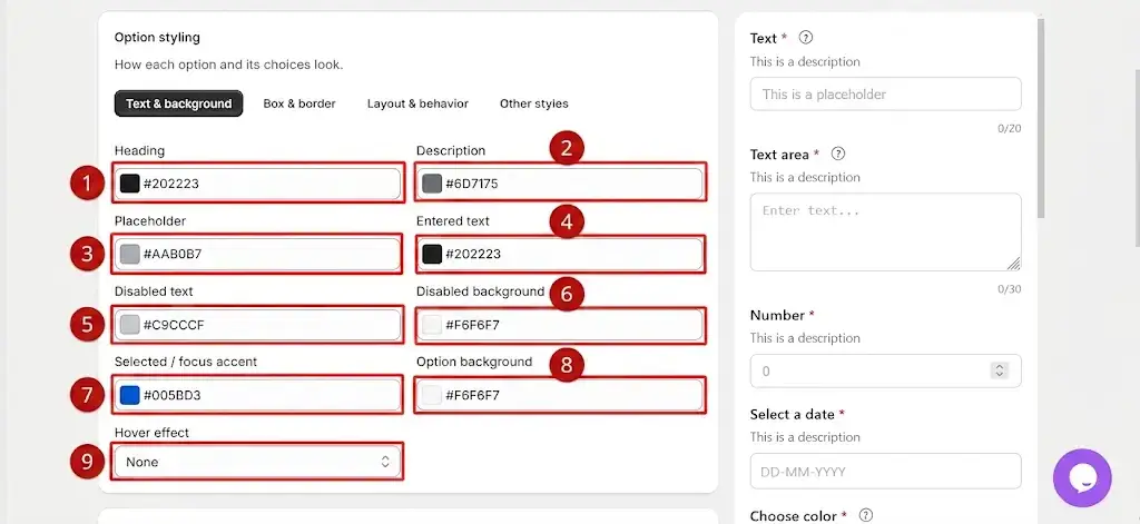
Heading: Sets the color of the option heading or title.
Description: Sets the color of the description displayed below or beside the option heading.
Placeholder: Sets the color of placeholder text displayed inside an empty input field.
Entered text: Sets the color of text entered or selected by the customer.
Disabled text: Sets the text color of disabled options or fields.
Disabled background: Sets the background color of disabled options or fields.
Selected / focus accent: Sets the accent color used when an option is selected or an input field receives focus.
Option background: Sets the background color of the option area.
Hover effect: Defines the visual effect displayed when the customer moves the cursor over an option.
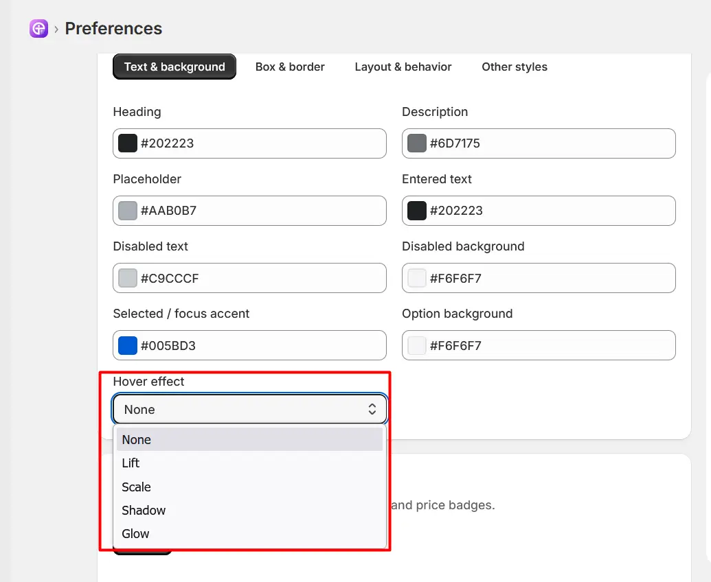
None: No visual change occurs when hovering.
Lift: Gives an elevation effect, subtle vertical movement to make the element appear lifted.
Scale: Slightly enlarges or expands the element to draw attention.
Shadow: Adds or intensifies a drop shadow behind the element to create depth.
Glow: Applies a colored outer highlight or glow around the element borders.
Open the Box & Border tab to control the dimensions, borders, spacing, and shape of option choices and swatches.
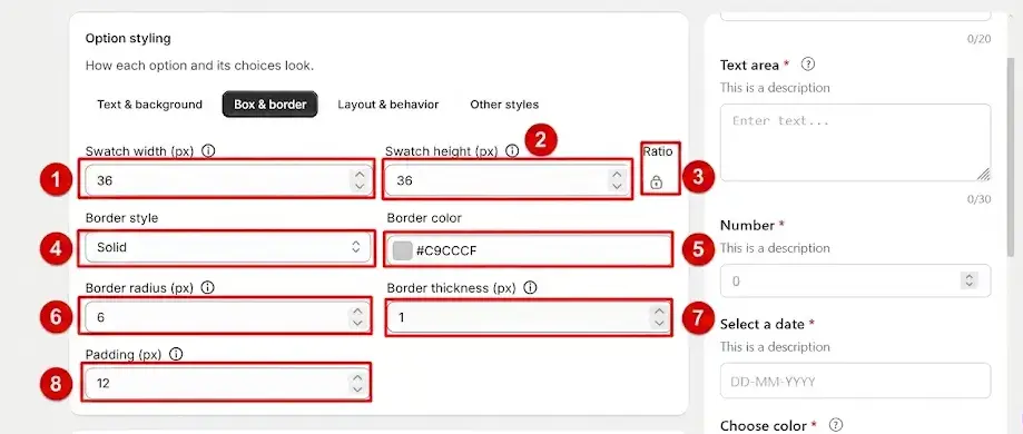
Swatch width (px): Sets the width of a swatch in pixels.
Swatch height (px): Sets the height of a swatch in pixels.
Lock ratio: Controls the width-to-height proportion of the swatch. Keeps the swatch proportions consistent when its dimensions are changed.
Border style: Defines the type of border displayed around an option or swatch.
Border color: Sets the color of the option border.
Border radius (px): Controls how rounded the corners of the option are.
Border thickness (px): Controls the thickness of the option border.
Padding (px): Controls the space between the option content and its border.
Open the Layout & Behavior tab to control the spacing and arrangement of options and their choices.
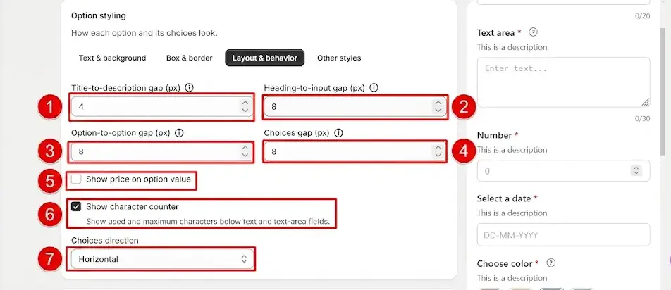
Title-to-description gap (px): Controls the space between the option title and its description.
Heading-to-input gap (px): Controls the space between the option heading and the input or choice area.
Option-to-option gap (px): Controls the space between separate options.
Choices gap (px): Controls the space between individual choices within an option.
Show price on option value: Displays the additional price next to an option value when enabled.
Show character counter: Displays a character counter for applicable text fields.
Choices direction: Controls how the choices are arranged, such as horizontally across the available space.
Horizontal
vertical
Open the Other styles tab to customize additional elements such as buttons, date pickers, required messages, and price displays.
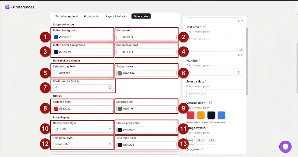
Button Settings
Button background: Sets the background color of applicable option buttons.
Button text: Sets the text color displayed inside the button.
Button hover background: Sets the background color when the customer hovers over the button.
Button hover text: Sets the text color when the customer hovers over the button.
Date Picker Settings
Date-picker calendar selected day: Sets the text color of the selected date in the date picker.
Today marker: Sets the color used to identify the current date.
Border radius (px): Controls the roundness of the date picker elements.
Other Settings
Required mark: Sets the color of the required-field indicator.
Message text: Sets the color of validation or informational messages.
Price Display Settings
Choice price style: Determines how an additional price is displayed next to an option choice
Choice price color: Sets the color of the additional price displayed for an option choice.
Title price style: Determines how an additional price is displayed alongside the option title.
Title price color: Sets the color of the price displayed next to the option title.
Under Storefront Surfaces, select the Tooltip tab to customize the appearance and position of help text and tooltips.
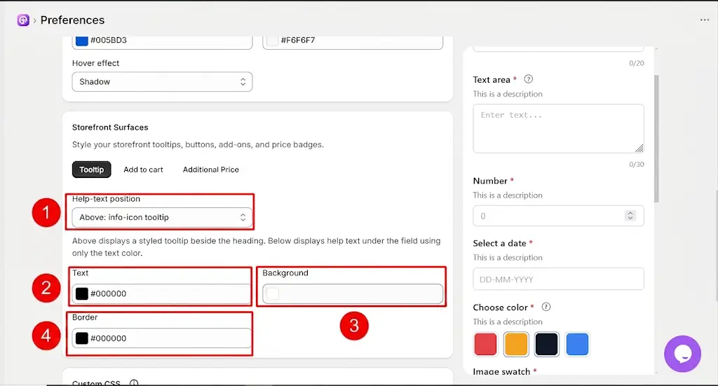
Help-text position: Determines where the help text appears in relation to the option.
Text: Sets the color of the tooltip or help text.
Background: Sets the background color of the tooltip.
Border: Sets the border color of the tooltip.
Select the Add to Cart tab under Storefront Surfaces to customize the appearance of the Add to Cart element.
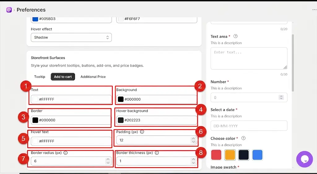
Text: Sets the text color of the Add to Cart element.
Background: Sets the background color of the Add to Cart element.
Border: Sets the border color.
Hover background: Sets the background color when the customer hovers over the element.
Hover text: Sets the text color when the customer hovers over the element.
Padding (px): Controls the internal spacing around the button content.
Border radius (px): Controls how rounded the corners are.
Border thickness (px): Controls the thickness of the border.
Select the Additional Price tab under Storefront Surfaces to customize the appearance of additional pricing displayed with product options.
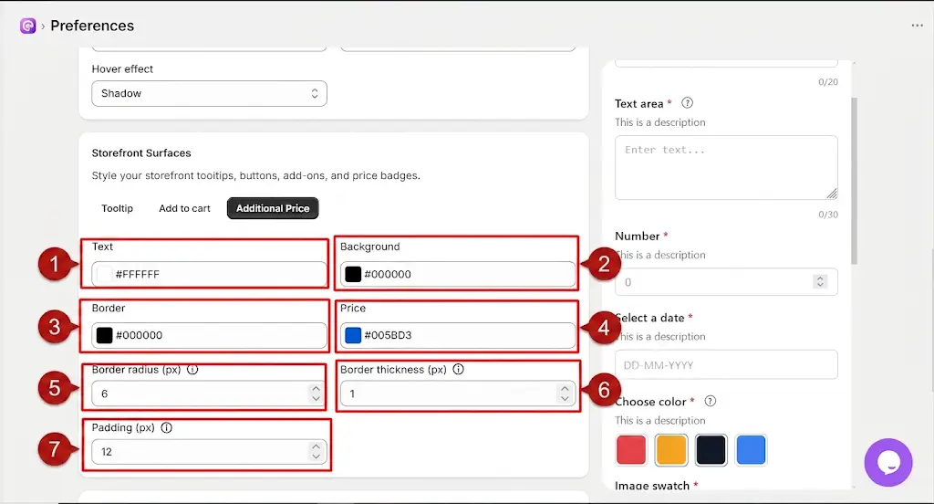
Text: Sets the text color of the additional price area.
Background: Sets the background color of the additional price area.
Border: Sets the border color.
Price: Sets the color of the additional price amount.
Border radius (px): Controls how rounded the corners are.
Border thickness (px): Controls the thickness of the border.
Padding (px): Controls the internal spacing around the additional price content.
To restore the selected theme to its default settings, follow these steps:
Click Reset: In the Theme section under the Design tab, click the Reset button in the top-right corner.
Review the Confirmation: A “Reset this theme to its defaults?” confirmation window will appear. It informs you that all custom changes, including colors, sizes, borders, and layouts, will be removed and set with default options.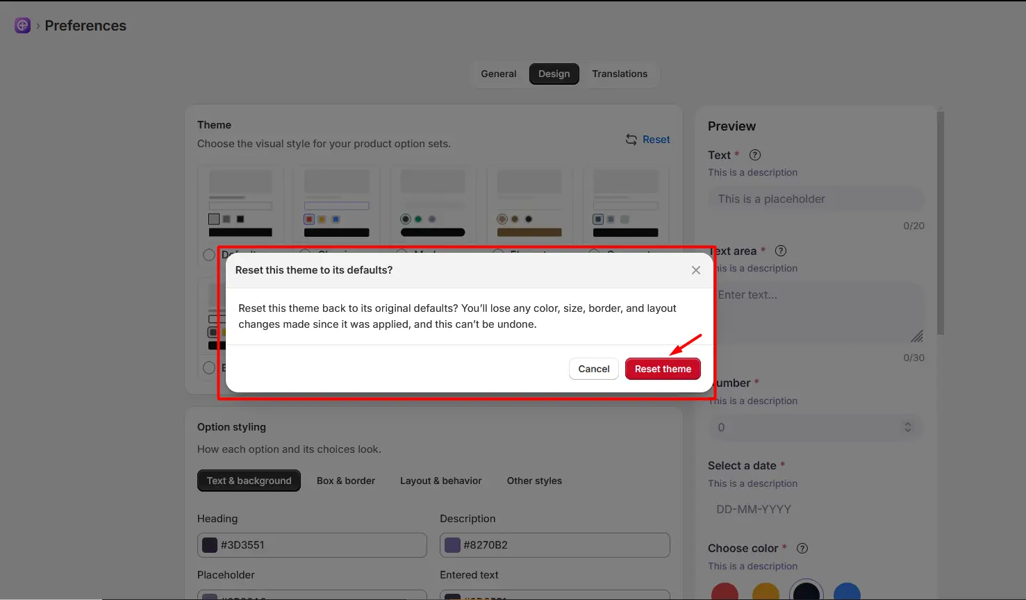
Confirm the Reset: Click Reset theme to restore the theme to its default settings. If you do not want to reset the theme, click Cancel or the X icon to close the window.
The Custom CSS section allows you to apply additional styling when the standard Design settings do not provide the level of customization you need.
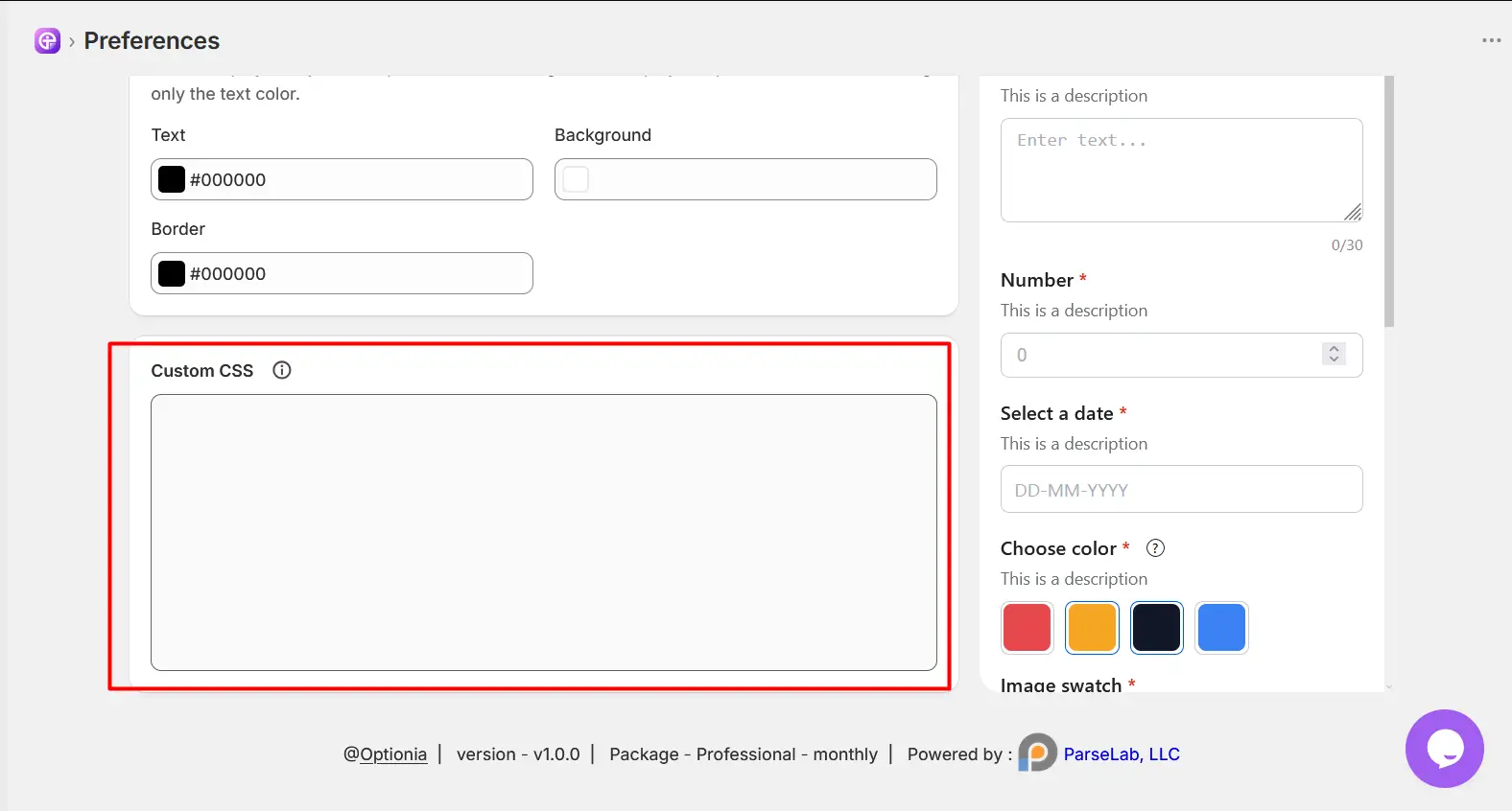
Enter your CSS rules in the provided editor.
Use CSS to make additional changes to elements such as spacing, typography, borders, positioning, or other visual properties.
After adding CSS, review the storefront to confirm that the styling is applied correctly.
After making your desired changes to the theme styling, click the Save button to save the changes to the currently applied theme.
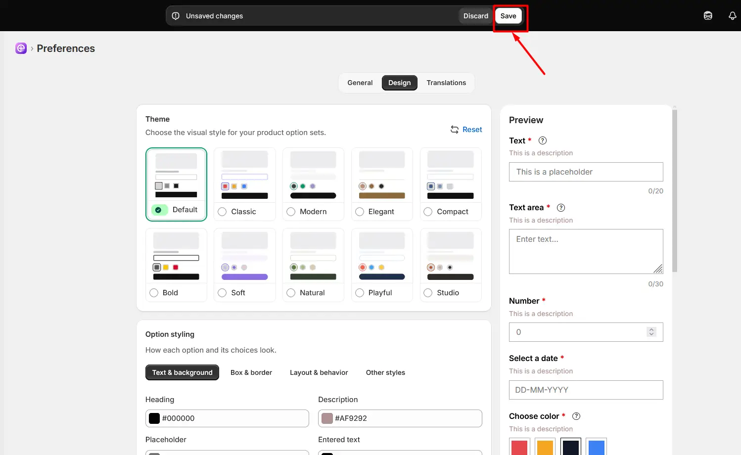
Note: The saved styling will be applied to newly created options on the storefront. Previously created options will continue using the styling that was applied when they were created. You can modify the theme styling or reset it to the default settings at any time. |
The Design tab provides a complete set of controls for customizing how product options appear on your storefront. You can begin with a predefined theme and then adjust individual elements such as colors, borders, spacing, layouts, tooltips, buttons, date pickers, and additional prices.
For more advanced customization, use the Custom CSS section. After completing your configuration, always preview the product on the storefront to make sure the design looks and behaves as expected for your customers.
Need Help?
 Getting Started
 Option Sets
 Orders
 Settings
 Configuration
 Live Preview
 Packages
 Help & Support
 Price Add-Ons
 Conditional Logic
 Design Theme Styling
 Uninstallation